Lead photo by Nicole Cohen, design by Sasha Bikoff (courtesy of Sasha Bikoff)
Gone are the days when pink was considered a bold paint choice for anything other than the nursery. From exclusive social clubs to hot spot restaurants, pink, in all its yummy rosy hues, is definitely having a moment. Not sure if you’re into blush or bubblegum? Check out five of our favorite shades of pink paint and discover how we’d complete the look with perfectly suited furniture and accessories.
Desert Pink
On a paint chip this peachy pink might seem a bit saccharine, but don’t be fooled. It’s much more versatile than you’d expect and beautifully complements trad and modern pieces alike. What’s not to love about a shade that can play nicely with chrome and raw woods? If you’re looking for an extra bit of luxe, try a high-gloss finish like designer Sasha Bikoff used in the living room above.
Consider Trying: Tropical Breeze by Valspar
Get The Look
Product_id 531155 not found

Raspberry Pink
Hankering for a hot pink moment in your home? Go for it! Such a vivid burst of color isn’t too much in a small space, such as an entryway, and can add balance (not to mention a dose of rock-n-roll) to stately furniture and architecture. We love the way designer Jonathan Berger used white trim to offset the impact of the color choice.
Consider Trying: Razzle Dazzle by Benjamin Moore

Bubblegum Pink
White is the most common backdrop for art, but don’t overlook this classic shade of pink when mounting work. It pairs well with darker shades with lots of depth, but also gives an extra pop to white. Just ask India Mahdavi, who lined the walls of her pink-on-pink-on-pink design for The Gallery at Sketch in London with 239 black-and-white works by artist David Shrigley. A new hue might be just what your old gallery wall is needing.
Consider Trying: Checkerberry by Glidden

Blush Pink
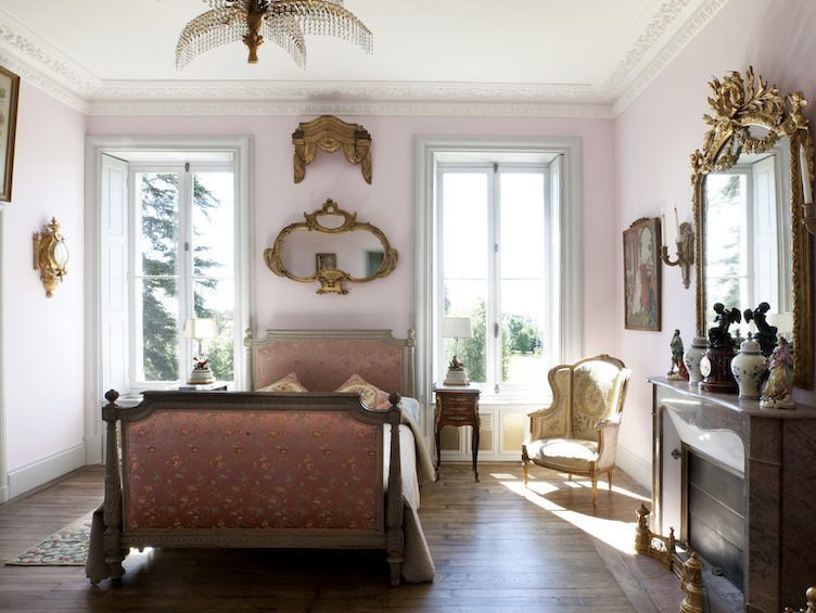
If elegance and the ability to handle the seriousness of substantial antiques is what you’re hunting for, this subtle shade of pink will get the job done, and then some. A calming color that pairs especially well with white trim, blush is perfect for the bedroom. Gold finishes work great with this shade, but for a hit of contemporary verve, try pairing it with brass.
Consider Trying: Demure SW 6295 by Sherwin Williams

Coral Pink
Wonderfully warm and inviting, a coral pink confers a sense of confidence to a space, but can have a similar effect on inhabitants with its flattering glow. Designer Miles Redd famously draped his Manhattan living room walls in pink satin (pictured above), but paint can help you achieve a similar look. And like Redd, don’t be afraid to deploy the graphic impact of black and white to keep the look in balance.
Consider Trying: Regal Coral Gables 2010-40 by Benjamin Moore


