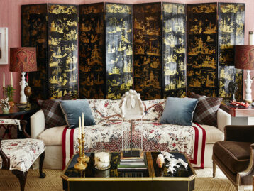
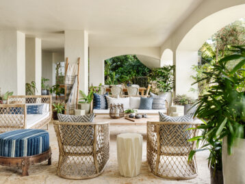
Birmingham-based Steele Marcoux is an expert in color, a skill she relies on as the editor-in-chief of Veranda. For 2025, she and her team at the magazine have picked Cosmic Cobalt as the Color of the Year. With “a history as vast as the heavens and a future as sparkling as the night sky,” this mystical shade is enjoying a surge in popularity. We spoke with Steele to learn all about why Cosmic Cobalt is the chic shade of the moment, ways to decorate with it, and how she sees it showing up in her Chairish favorites.
SHOP COSMIC COBALT ON CHAIRISH >>>
Shop Cosmic Cobalt On Chairish
Product_id 20413195 not found

How do you choose the color of the year? And what was it about Cosmic Cobalt that you loved?
Our process for choosing Color of the Year is so much fun. Every staffer participates by pitching a color that he/she thinks will be the next year’s color of the year. Each staffer makes a mood board and delivers a three-minute pitch to the rest of our staff about why this color is relevant for the year coming up. We ask staffers to consider history, trends, cultural influences, and what’s on the horizon for the year ahead when developing their pitch. After pitches are delivered, the entire team votes on top choices. From there, we go to a semi-final round, then a final round. Choosing the winner comes down to me! It’s always really hard to make the call. This year, as with last year, I went with the stronger pitch – not the color I personally liked most!

To that end, what I loved about the pitch for Cosmic Cobalt was how our Creative Director (yes, it was his pitch!) connected the color to history, nature, culture, global design, and craftsmanship—influences and content categories that resonate deeply with the VERANDA audience. Cosmic Cobalt, a brilliant blue with flecks of gold in it, is rooted in royalty, dating back to ancient history when Egyptian pharaohs prized objects and amulets carved from Lapis lazuli. The Chinese discovered that the lapis lazuli stones could be ground up to create a pigment called ultramarine, and this was used to create some of the first blue and white Chinese pottery. The pigment was so valuable, it was more expensive than gold by weight. (Eventually, it was discovered that this rare, vivid color could also be made using mineral cobalt ores from Persia or the middle east, which gave us the name cobalt blue.) The color has been prized by artists in more recent history as well, from Renaissance painters to modern masters like Miro, Mondrian, and even Yves Klein.

Today, the color is just as at home in a breezy beach house as it is a moody, urban setting. Its connections to sea and sky make it a clear choice for those who want to bring the outdoors in. And with our renewed interest in space, Cosmic Cobalt could not be more relevant to this moment.

Shop Cosmic Cobalt On Chairish
Product_id 20413176 not found
How do you see the color being used in design?
One of the reasons we were so excited about this color is that it is surprisingly present in both interior and exterior design. Inside, we love Cosmic Cobalt as a foundational color for what we’re calling “the night room,” which we think every home needs. Night rooms are the evening counterpart to sunrooms. They’re meant for lounging, reading, enjoying a nightcap and, yes, connecting with the night sky. What could be better than Cosmic Cobalt in a night room? You can bring elements of the night room into other spaces like powder rooms or bedrooms by covering ceilings in starry wallpaper. We also love lacquered cobalt paint in dining rooms, bars, and butler’s pantries. Outside, we love cobalt in garden details like planters, fencing, walls, or other garden structures (think Jardin Majorelle). Finally, we love collections that feature cosmic cobalt in glassware, porcelain, jewelry, art, books, and more.

Do you see any vintage or antique applications for Cosmic Cobalt?
Absolutely! I am especially smitten with cobalt glassware, from vintage midcentury vases to 19th century silver overlay. You’ll also find cobalt glass used in antique and vintage furniture from time to time, whether as tops in coffee tables or inset in cabinet panels. Finally, I think every room looks more luxurious with a touch of cobalt lacquer, whether from a vintage box or tray to a small side table or even lampshade.

Any tips for colors or patterns to pair it with?
Our favorite tip for things to pair with Cosmic Cobalt is to consider metallic accents. And what’s great about the deep blue of cobalt is that it looks just as beautiful with cool colors as it does warm ones. When building palettes, I like to look across the color wheel for complementary color inspiration – with cobalt, I would go with chartreuse or soft cantaloupe or tangerine shades of orange. That said, we’ve interviewed designers about what they like to pair with cobalt and their answers range from lilac, pink and red to chocolate brown and emerald green. It really is a universal color!
Lead Image: As seen in VERANDA. Interior Design by Nick Olsen (@nickolsenstyle), Photograph by Thomas Loof (@thomasloof).


