Designers know how important markets like High Point and Salone del Mobile are—not only for networking with colleagues, but for sourcing, connecting with vendors, and discovering inspiration for their upcoming projects. These markets and all other spring events have unfortunately been cancelled because of COVID-19, so Chairish decided to host our first-ever Spring Market Preview, where brands were able to virtually showcase their newest products and seasonal lines that they would have otherwise debuted in-person.
To kick off the Spring Market, style experts Michael Boodro, veteran editor and host of The Chairish Podcast, Anna Brockway, Co-Founder and President of Chairish, and AD Pro Editor Katy Olson shared their takes on spring trends, styles, and favorite products from the Chairish Spring Market Preview.
Be sure to shop The Spring Market Preview and don’t miss our full trend video coverage.

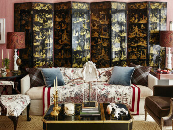
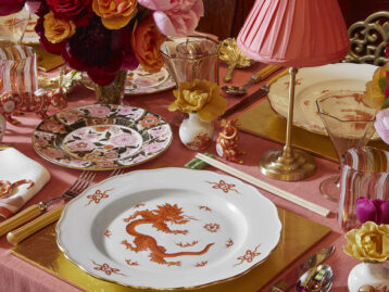
Pink and Red
“I think this is a really fun color pairing. I think you have to be pretty careful about how you use this combination together, but when you do it right, it really, really works.” – Anna Brockway

Sottsass-Inspired
“Ettore Sotsass founded the Memphis movement and his style has really returned to the forefront in the last year or so. It’s really about forgetting ‘good taste;’ let’s have some fun!” – Michael Boodro

Grape Juice
“This is a color we are seeing really fly off the shelf across a variety of different categories. It’s remarkable how many other colors it goes well with. It looks fantastic with navy blue; it looks great with a moss green or even a chartreuse. It looks terrific with a sunflower blue, even a sky blue, and it can even look good with reds. It just really has a lot of legs.” – Anna Brockway

Mighty Oaks
“It’s not just about the material but more about the imagery of oak.” – Katy Olson

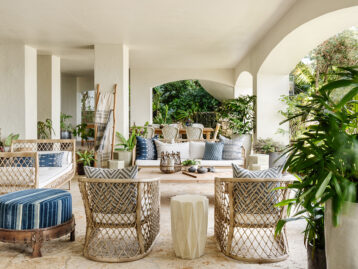
Mediterranean
“This is one of my favorite trends. It’s a more elevated take on a summery look with limestone, pale colors, and beautiful textures. It’s slightly nautical but not preppy at all. Much more elegant.” – Michael Boodro

Op Art
“We’re not just talking about art, we’re talking about the notion of pop colors and graphic shapes. We’re seeing that extend throughout through lighting and furniture.” – Anna Brockway

Summer Gold
“The color itself we see as a really fresh alternative to beige and the neutral grey… It’s summery but elevated.” – Michael Boodro


