Sometimes all it takes are a few daring design moves and a punchy pattern to design an awe-inspiring room. Modernism week’s Christopher Kennedy Compound is no stranger to unexpected and unique spaces, and designer Sarah Sherman Samuel’s fanciful makeover of its east guest bedroom was perfectly befitting of the avant-garde Palm Springs show house.
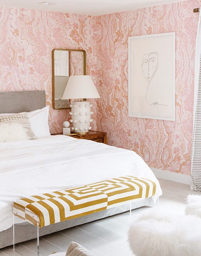
Recognized for a modern design aesthetic that blends the chic and subdued with earthy organics, the LA based designer went bright and feminine with a pinch of vintage to transform the space. With a blush, swirling agate wallpaper of her own design as the base, Sarah combined a playful mix of texture and scale, a bit of (hurried) DIY handiwork, and unique vintage pieces to craft this glam desert retreat.
We sat down with Sarah for an inside look at how the room came together, plus she shares five must-read decorating tips.

How did you begin the design process?
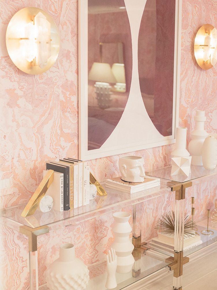
I started with the wallpaper, which is my own design. It is a gemstone-like mural pattern that I’ve named Agate (it’s in production now and will be available later this year). From a distance it reads as a light shade of pink but up close you see all the subtleties of a natural stone.
What design factors are key to keep in mind for a bedroom?
I think the color palette in a bedroom is especially important. Color is so powerful. It can make you feel energized or calm. In a bedroom where you want to be able to relax, it’s nice to have a soothing soft palette to lull you to sleep.
Shop the Look
Product_id 1092434 not found

Can you break down your approach to color here?
The wallpaper is such a bold statement that I built the room around it with a soft and fairly neutral palette. A pink agate wallpaper can go over-glam easily, so I brought in natural wood tones and large scale pieces to tone it down a bit and give the eye a place to rest. I wanted to keep a soft and calming palette, so I didn’t bring anything high contrast into the space. Shades of grey, lavender, natural wood tones, gold, and white all compliment the soft pink, and if you look closely at the wallpaper, all of those shades could be plucked right from the pattern.
Tell us more about your strategy around scale.
The room is considerably large, especially for a guest room, so it allowed for a lot of space to play with scale. I chose a few over oversized items like the bedside lamps and large scale artwork and mirrors, and spread them around the room for continuity. The huge lamps could easily overpower a small nightstand, so I chose the vintage chunky wood side tables to carry their visual weight. I love playing with scale and exaggerating size relationships in a space.

How did you think about mixing patterns in the space?
I approach pattern mixing like I do most things in design; wanting the end result to strike a balance. The wallpaper is a very detailed pattern and it is on every wall in the room. I paired it with the large scaled graphic patterns in the rug, bench, and curtains because they are bold enough to break up the more textural pattern on the walls. I spread the bold patterns around the room to keep your eye moving from piece to piece, is what helps to create that balance.

Why do you think pink and brass are having such major moments right now?
To me, blush pink is such a classic color that can also feel somewhat unexpected. It has just a hint of color so it somehow straddles the line between a statement color and a neutral. It also has an ethereal quality to it that I just can’t get enough of. I’ve always loved mustard yellow and blush together, so pairing soft pink with a gold brass tone has a similar effect, just turned up a notch with the metallic finish.

What’s a design rule you love to break?
They’re all fair game.
No room is complete without…?
A little greenery, even though the show house didn’t have any (see, I’m already breaking my own rule).

SARAH’S 5 DECORATING TIPS!
1. Sprinkle Around Large-Scale Statements
If you have something large-scale on one side of the room, try and match the scale in other areas as well. In this room the oversized round mirror on the opposite wall complements and balances out the scale of the lamps.
2. Go Big (and Small) With Pattern
If you’re just starting to play with pattern, as a rule of thumb it’s a good idea to start with one bold or large scale pattern, and two or more smaller scale supporting patterns. Varying the scale of the patterns allows them to stand next to each other without competing.
3. Mix Materials Throughout a Space
If you imagine your room as a giant scale, and you put all the wood finishes on one side, it would topple over. The key is to try spreading the wood finishes around the room enough so the scale doesn’t tip too far in one direction.
4. Take the Wallpaper Plunge
If you find a print that you love, chances are you’ll love it even more when it is up on the wall. If you want to test the wallpaper waters, try it out on an accent wall before committing to a full room.
5. Give DIY a Try
Sometimes reupholstering is as easy as wrapping a present, but using a staple gun instead of scotch tape. The bench I reupholstered in literally minutes, just 2 hours before the show house opened to the public.


