In design, much ado is given to finding your personal style. But what if you’re a modernist who also courts traditionalism from time to time? Rather than shunning any propensity toward one style or the other, designers are increasingly encouraging clients to embrace multiple sides of their style personality, even if those styles (i.e. traditional and contemporary) sit at polar opposites of the spectrum. While designers pros don’t sweat a paradoxical effect—by which we mean cozying up Eames-centric seats to vintage avian wallpaper—some of us could use a little more assurance that clashes can be irresistible. To help, we’ve collected 10 rooms that spotlight both contemporary style and traditionalism and offer permission to embrace a bit of dissonance.

For clothing brand Tuckernuck’s historic Georgetown headquarters, DC-based designer Zoe Feldman wanted to play up the brand’s modern milieu while paying homage to their traditional digs. To execute on the concept, Zoe explains that they layered “modernized, vintage furniture with New England-inspired wallpapers and accessories reminiscent of Nantucket and its surroundings.” With a Nantucket-approved palette chock full of preppy shades leading the way, the mix of old and new feels entirely cohesive—not to mention, unconventional, “un-corporate,” and unabashedly fun!
Get the Look
Product_id 2850294 not found
Product_id 891430 not found

“My favorite rooms are eclectic ones,” says Chauncey Boothby of Chauncey Boothby Interiors. “They don’t necessarily have to fit a certain genre, but they should feel like well-curated spaces that reflect the individual’s tastes.” To bring unexpected dynamism to a library with traditional millwork and a brick fireplace facade, Chauncey chose to integrate iconic Mid-Century Modern pieces to the mix, including an Eames Lounge Chair, a pencil-leg coffee table, and Serge Mouille-inspired light fixture. By sticking to a palette of neutrals, the entire scene looks as holistic as can be.

Provincetown, Massachusetts, another town awash with traditionalism, provides the venue for this eclectic pad cued up by DC designer Paul Corrie of Paul Corrie Interiors. “The juxtaposition of traditional and more modern elements can bring about movement and excitement,” explains Paul, who elected to couple up a show-stopping Empire table with stackable white bistro chairs. Not only are the two opposites era-wise, but cost-wise as well. To make it work, Paul adopted a white canvas-like backdrop and stuck to a strict palette of pink, black, and gold accents. “I’m a huge fan of contrast because it reflects a truly collected style,” notes Paul.

For a less skilled designer, the presence of parquet floors could dictate that a room take a traditionalist turn, but for designer Andrew Flesher their existence in a stately New York co-op merely provides a stage to juxtapose modern furnishings to dramatic effect. To incite a visual game of push and pull, Andrew paired a Warren Platner dining table and acrylic S-shaped cantilever chairs with a dainty cabriole-leg bar cart. The combo lends tension as well as interest to the space. Drapes fashioned from textile with a historical-feeling pattern but an assertively modern color-way, help tie the disparate eras together as well as make it clear that the room’s eccentricity is as purposeful as it is artistic.
Get the Look
Product_id 2950189 not found
Product_id 1616996 not found

Sometimes the presence of a beloved heirloom can dictate that a contemporary house adopt a more eclectic narrative. For designer Liz Caan of Liz Caan & Co. a homeowner’s Windsor dining set, which stood out stylistically from the rest of their furniture, encouraged her to think about how to make traditionalism and contemporary amicably co-exist. “Since the client loved their existing heirloom table and chairs, we decided to counterbalance these pieces with more contemporary lighting, clean-lined upholstery, and pillows to help bridge the mix,” Liz explains. “We chose a palette that is equal parts classic—blue—and bright green. Visually, it helps the vintage pieces stand out as the reigning personality of the space.”

Once again, designer Andrew Flesher is never one to shy away from the diametrically opposed, as showcased in this style-bending dining room. Throwing caution to the wind, Andrew equipped the space with a traditional Moroccan chandelier, space-age seats, and a Shibori-inspired rug. The mix works in part because of the home’s bones. Homes with early 20th-century architecture, such as Tudors and Craftsmen often come equipped with era-straddling architecture, such as curved corners, built-ins, or arched doorways. These details make it easy to contextualize both old and new designs as well as cue up an intriguing interplay between the two.
Get the Look
Product_id 2798897 not found
Product_id 2617367 not found
Product_id 2682717 not found

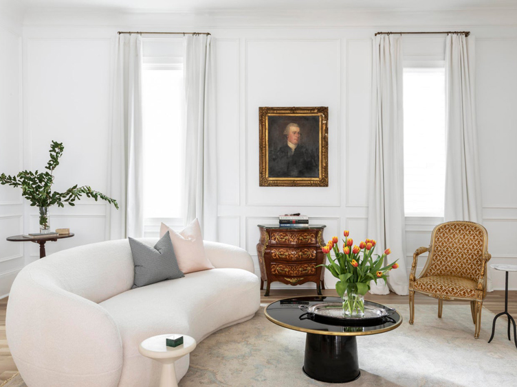
The French are known for many things. Among them—an uncanny ability to mix vintage and new. Equipped with this notion, Tampa-based designer Sherry Shirah set out to imbue this New Orleans home with a Parisian pied-a-terre feel. To set the tone, Sherry suited up the walls in an old-world treatment: molding. However, she opted for an application with a modern, graphic twist, with little traditional embellishment. “With the very linear lines of the paneling in place, we then introduced a softness with the curved sofa and round coffee table,” Sherry explains. Sherry’s decision to juxtapose the room’s linear wall treatment with sinuously curved furniture reveals another golden trick to achieving cohesion: complementing one good contrast with another.

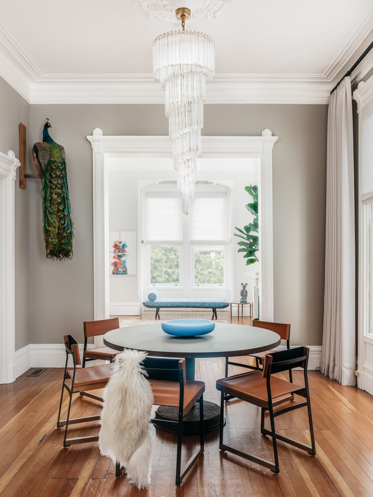
A client with an impeccable eye for art who desired a casual interior that would metamorphose with his ever-rotating art collection provided designer Holly A. Kopman with the rubric for this style-blurring San Francisco dining room. “This home is classic San Francisco Italianate architecture and has wonderful bones,” explains Holly. “The goal was to combine the client’s requests in a fun, but sophisticated way. The 5-foot long chandelier is a vintage Venini, while the 20th-century peacock—a nod to traditional—has been used in interiors dating back as far as Roman and Byzantium era.” A repetition of shapes (note how both the chandelier and peacock possess draping tails) helps to bring harmony to the stylistic oppositions.

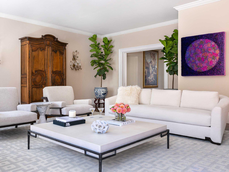
If your traditional pieces are more visually domineering than your modern pieces (and in all likeliness, they will be!), choosing modern furniture in a peacemaking neutral can make the look go off without a hitch. For a living room that Moraga, California-based designer Kimberley Harrison designed for collecting clients, Kimberley selected modern furnishings in a monochromatic white palette to offset a French armoire and crystal sconces. “Blending contemporary and traditional design elements in a home creates a timeless, eclectic beauty,” says Kimberley.
Get the Look
Product_id 2684594 not found

Sometimes it’s a single piece that straddles the line between traditional and modern—such as a hot pink and tangerine antique rug—that sets an era-elusive room in motion. So was the case for Brooklyn-based designer Kathleen Walsh. “Soaring crown molding, decorative fireplaces, and spectacular light are traditional elements of brownstones,” explains Kathleen. “We loved these details, but added a contemporary twist through an antique hot pink and tangerine rug, the family’s art collection, and Deco-inspired embroidered fabrics.” For those who desire a mixed space but question their ability to pull it off, it’s worth noting that Art Deco is especially palatable with modern styles.
Lead image by Dan Cutrona / Photo courtesy of Paul Corrie Interiors


