Since launching the Chairish Print Shop earlier this year, we’ve been on the lookout for examples of how our prints are making real homes look more beautiful than ever. Cut to: the Internet’s most epic blogger design battle, The One Room Challenge. While the plot is simple enough—redesign a room over the course of the month and blog about it along the way—we decided to ruffle things up a bit and ask participating designers to factor a print from the Chairish Print Shop into their rooms. Here are the stunning results!
SHOP THE CHAIRISH PRINT SHOP >>

Angela Blehm
Angela Blehm isn’t just the designer behind The Painted House, she’s also one of our Chairish Print Shop artists. Ever the savvy designer, Angela decided to go big when it came to the One Room Challenge and elected to take on her entire guest house! In the guest suite’s bath, she used Kate Roebuck’s “Sunshine Pool” atop a densely patterned wallpaper by Farrow & Ball. The result? Proof that patterns can absolutely play nice.

Alyssa Wieske
Alyssa Wieske of the Ontario-based design firm Coco & Jack wanted to transform her basement into a functional and aesthetic-minded playroom for her three littles ones. To get the job done, Alyssa selected a fun, antelope-print carpet and added whimsical touches like Angela Blehm’s “Lilac Bow” print. In addition to complying with her son Jack’s request for “something blue,” Blehm’s print is equal parts playful and sophisticated, just like the space itself.

Nicole Cohen
Nicole Cohen of the blog Sketch 42 selected her two boys’ rooms to redo—which just so happen to be mirror images of each other! Since the obvious focal point in the rooms is the half wall that divides the rooms, Nicole painted the wall a knockout yellow and topped it with Lesley Grainger’s “Gathering.” Because the piece is an abstract composition, it lends a more modern tone to the charm-filled space.

Shannon Claire
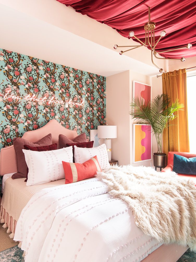
Dubbed #projectsexycoffin (thanks to this bedroom’s minimal footprint), designer Shannon Claire added big style to her client Libby’s master bedroom. While Shannon considers herself more of a subdued colorist, she opted for booming palette of pinks and tangerines. Fittingly, Shannon selected Stephanie Henderson’s “Hairpin Serpentine in Orange & Pink” and “Red & Pink” to complete the look.

Holly Hollingsworth
Holly Hollingsworth, who runs the blog The English Room, purchased her childhood home earlier this year. For the One Room Challenge, she elected to redo the den. While Holly loved the room’s beams, brick fireplace, and overall “coz” vibes, it needed to be modernized. For a fresh look, Holly splashed the space with technicolor, including Stephanie Henderson’s “Set of 4 Forevers I.”
RELATED: MEET THE CHAIRISH PRINT SHOP ARTISTS >>

Natasha Habermann
North Salem, New York designer Natasha Habermann chose her long-neglected living room to turn into a tranquil, Swedish-inspired retreat. First off, she installed clean, white paneling on all of the walls. Next up, she introduced furniture and accessories in soothing shades of aquamarine and dove gray. Her art selections played off the same notes, which made Leslie Weaver’s “Mirella” a perfect choice.

Michelle Gage
Philly designer Michelle Gage promised to deliver a legit master retreat (keyword “retreat”), and deliver she did. Since her spacious master could have easily wound up feeling empty, Michelle packed it full of pattern. Shibohri-style wallpaper adorns one wall, an over-dyed fuchsia Persian rug anchors the bed, and Kate Roebuck’s “Coral Pool” adds big pattern to the room’s break-out sitting space.
Shop the Look
Product_id 919372 not found

Linda Holt
Designer Linda Holt was sponsored by the Boston Design Center and was granted an unfinished loft space to turn into a fantasy pied-à-terre. Although the space is airy, Linda introduced warmth with saturated color and upholstered furniture with an architectural edge. Mimicking the furniture’s angles, Linda then selected Melvin G.’s “Madame Paradis” for the dining room gallery wall.
Shop the Look
Product_id 584914 not found

Ashley Goldman
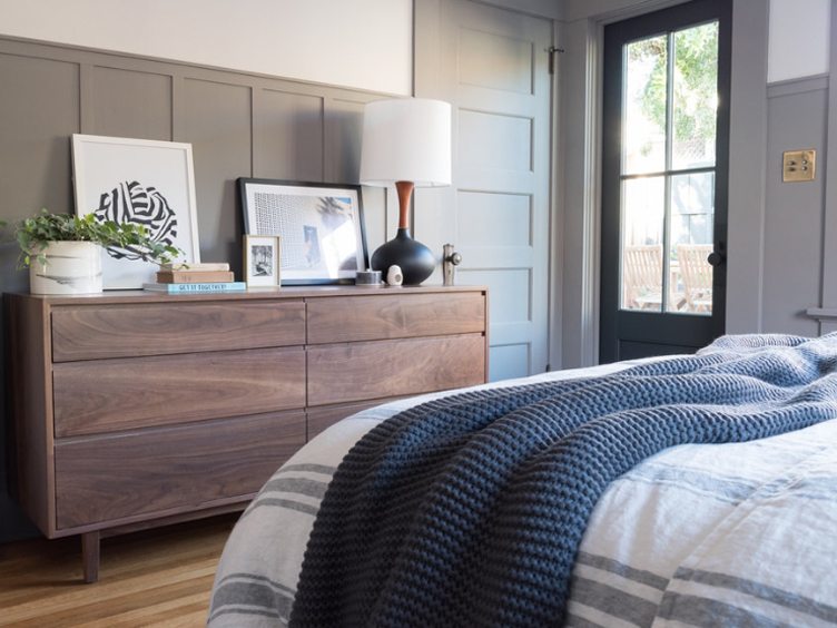
Ashley Goldman’s blog The Gold Hive revolves around the ongoing renovation of her 1915 San Diego Craftsman home. For Ashley, the One Room Challenge was an opportunity to update her long-overlooked master. To keep with the relaxed, coastal mood of her home, Ashley first selected a soft, gray-washed palette which she partnered with sleek, Mid-Century style furnishings. She also kept accessories to a minimum, making Angela Blehm’s “White Knot” an inspired choice for her top-of-the-dresser vignette.

Catherine Williamson
Catherine and Bryan Williamson, the married duo behind Mix Design Collective, tackled their Ohio bungalow’s main living space. Since the duo loves an eclectic look, they opted to combine elements of Mid-Century Modern, Boho Chic, and Contemporary styles. Since furniture and accessories ran the design gamut, the duo selected abstract art, including Leslie Weaver’s “Sansa” to keep the space feeling collected and cool.
Shop the Look
Product_id 751270 not found
Shop the Chairish Print Shop >>
Lead photo by Emily O’Brien Photography


