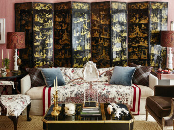
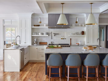
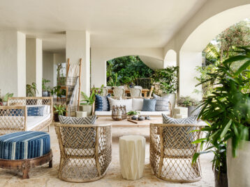
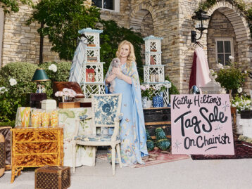
From designing the Manhattan headquarters of Gwyneth Paltrow’s Goop to building cult-favorite lifestyle and editorial brand Fenimore Lane, Ariel Okin works across genres to create complete worlds, down to the flowers she styles in a space. (Hydrangeas and peonies are personal favorites.) Known for her “traditional with a twist” aesthetic, the designer, writer, and editor in chief layers styles and eras to create storied spaces. Read on for her style tips and Chairish favorites.
SHOP ARIEL OKIN’S CHAIRISH FAVORITES >>>
Shop Ariel Okin's Chairish Favorites
Product_id 20984303 not found
Tell us about how you launched your design practice. You do many things: interior design, writing, product design, creative direction, collaboration with brands. How have these many projects and talents informed your approach to design?
I went to college for journalism and graduate school for public affairs. The thought of becoming an interior designer never occurred to me while I was growing up or in school. It just never even presented itself as an option. My mom is an interior designer and has excellent taste, so I was always exposed to fabric stores and such, but it just felt like fun. When I was living in the city right after college, when I first started graduate school, friends would come over to my apartment and mention that they liked what I did with my space, and they would ask if I could help them with theirs. This was the era when friends were moving into their first studio, or combining their things and moving in with a boyfriend for the first time. It was really fun, and I quickly realized that I was spending more time helping friends for free than I was on my actual day job. I think in hindsight that’s the crucial learning: That this really just felt like fun, and not work, and I cherished the time I spent sourcing or putting schemes together, and I looked forward to it – this was what I did to relax. And I still feel that way – I can’t believe I get to do this every day; I’m so grateful!

Those jobs turned into referrals and soon I was getting real clients. I designed on the side for a while, and then went out on my own about 2.5 years after juggling both jobs, when I had built up a book of business large enough where I felt comfortable leaving. I’m so glad I did!
I’ve been writing since high school for various publications, and I’ve never stopped – it’s a big piece of how I flex the creative muscle in my brain, and when some of the places that I freelance for weren’t taking outside pitches during a freelance freeze at the beginning of Covid, that was what inspired me to start Fenimore Lane, which is the editorial side of my business. That has grown into a successful podcast, e-commerce business, and now our in-person annual Design Summit at The Mayflower Inn & Spa. That side of the business is so exciting for me to grow and strategize on, and I really love ideating on how to continue to expand the brand in new and exciting ways. The product element is also so fun; I love working with brands to bring our distinctive vision to life in the form of products that can live in people’s homes. I find it so gratifying to see lighting, for example, through my collection with Mitzi, being used in various ways in homes all over the country.
Overall, whether it’s product, editorial, creative direction, etc., everything is always guided by the key principles of our brand ethos, everything should always feel very cohesive and intentional; having a very clear brand point of view is incredibly important to me.
For our design projects, those are really guided by the individual clients themselves, which is why each project looks so different, and that’s the most fun part of my job, just delving into these worlds with our clients and creating the “movie sets” that they live their lives in!

Shop Ariel Okin's Chairish Favorites
Product_id 21215174 not found
You’re known for “tradition with a twist.” Every space is unique and has its own mix of modern and traditional elements. How do you go about achieving a distinct sense of place in each project?
I really love the term “distinct sense of place,” and it’s something that I think about intentionally and frequently during every phase of a project. It’s a concept that I learned from speaking with Gil Schafer on Talk Shop, as well as how he explains it so eloquently in his wonderful books, and it’s an important one: asking yourself what is the provenance of this project, who are the clients, what is the world we’re envisioning, together, for them? I think those are the key distinctions that make each space unique. In terms of the mix of modern and traditional, I never like spaces to feel fussy or too serious. Buttoned up rooms don’t get used very often. They need an off-kilter element to make them feel approachable, and interesting. Mixing eras, patinas, shapes and silhouettes – that’s what makes a space feel layered, unique, and warm, and also doesn’t pin any space into one era or genre. Mixing, say, a Parsons style table with a more traditional English roll arm sofa, a classic bell jar light fixture and modern, clean lined sconces and an oversized piece of modern photography – that gives you tension, the unexpected pairings – that’s what makes something interesting. And tying it all back to the client’s personalities and preferences, the home’s architectural history, the town’s architectural vernacular – all of that gives spaces a sense of place and a real underlying meaning behind each selection.

Shop Ariel Okin's Chairish Favorites
Product_id 21717100 not found
You have a distinctive color palette that is often grounded in warm, neutral tones layered with classic blues, greens, and a mix of prints. Could you describe your approach to layering colors, patterns, and styles? Any tips for color combos that you love or ways to layer textures?
Our color palettes are always informed first by our clients. We do a long intake meeting called a Creative Brief to kick off every project, where we show the client mood boards that we create, based on inspiration images they send us as soon as we sign on with them. We go through tons of reference images to talk about what they’re responding to, not responding to, favorite colors, etc. Oftentimes clients are inspired by nature, or want to highlight the indoor/outdoor element of their homes, and so blues and greens make their way into our work frequently, but we just finished a recent project in Greenwich where the main family room where they all congregate is anchored by an unexpected fiery coral red, inspired by a piece of artwork that we unearthed unframed in their basement. We had that piece matted, framed and hung with pride of place above the mantle (it’s a painting of coral with moss) and the palette is complemented with ecru and ochre and lichen, all colors we haven’t really paired together before. Each project is different, and the inspiration comes from unique places to the owners, but my approach is always the same – the larger pieces are grounded in neutrals, the pillows and accessories provide pop of colors and intrigue, and we’re always mixing textures if we’re working in one continuous tone on tone palette to keep things interesting.

Tell us a little bit about your approach to vintage. How do you like to bring antique and vintage pieces into your projects?
I primarily source vintage and antique pieces for every project. From lighting to casepieces to art and upholstery, we utilize it all. We incorporate more vintage and antique items than anything else, minus custom upholstery. I just don’t think you can find the same character, patina, quality, and quirkiness in newer pieces – there’s also the “one of a kind” element – those pieces make spaces feel special and unique to their owners. I never want anyone to walk into a home we’ve done and feel like they’ve seen it one hundred times before all over Instagram or in their neighborhood. Creating spaces that are bespoke and wholly inspired by their owner is the element of our work that I take the most pride in. We try to really never repeat prints, we’re constantly using new textiles and wallpapers, and iterating again and again to provide clients with really individual results, and a big piece of that comes from utilizing vintage and antique items.

Shop Ariel Okin's Chairish Favorites
Product_id 16798127 not found
Could you choose a few favorite projects and/or rooms you’ve done (we know it’s hard)? Any spaces in particular that stand out to you and why?
That is so hard! Every project that we start is always just so fun and exciting because it’s something new and fun. We’re currently working on a few historical renovation projects, one is a landmarked Park Slope townhouse in Brooklyn and one is a 1930’s Colonial in New Jersey, and then we’re also working on a gut renovation of a waterfront home in Cape Cod that is a multigenerational property for a wonderful couple, their four children, and their grandchildren, which is so beautiful. They are all so fun in such different ways – city, country, and by the sea. It’s a lot of fun to work on these different projects as challenges to our “norm” to keep us continually iterating and fresh. A recent project we did that I am really proud of is our Kips Bay Palm Beach showhouse space, called Trellis Garden. Inspired by the architecture of John Volk and Maurice Fatio and the understated classic elegance of 1960’s Palm Beach, that showhouse space was a real labor of love!
ON CHAIRISH & VINTAGE PIECES
What do you find most compelling about Chairish?
We utilize Chairish for truly every project; we place a huge focus on vintage and antique pieces at our firm, and finding unique pieces that feel loved and lived in and have the right amount of patina is so important to creating a layered, warm space. We find all of that and more – plus custom pieces and new brands that we’ve never seen before – all on Chairish. The curation is top notch, too!
How does sustainability factor into your design choices and love of vintage?
Sustainability is always top of mind for us when sourcing, and a big reason why we lean on utilizing vintage and antique items so frequently. Also, the quality of pieces made in eras past usually so far surpasses what’s made currently in terms of craftsmanship and materials that you just simply can’t replicate some of these items nowadays.
A FEW DESIGN FAVORITES
Favorite way to create a statement-making moment in a room? High gloss ceiling or a striking wallpaper or hand painted mural.
Favorite paint color? Currently tied between Farrow & Ball’s Vert de Terre and Borrowed Light (Borrowed Light is a perennial favorite at AOI.)
Favorite piece of art in your home? Two Gracie panels my husband commissioned for me on my 30th birthday that hang in our family room, which is the heart of our home.
Favorite style icon? Interiors, Rory Cameron. Fashion, CBK.
Design destination every creative should visit at least once? Florence!
A FEW LIFESTYLE FAVORITES
Favorite vacation destination? Palm Beach over Christmas. It’s been my happy place since I’m a little kid.
Favorite hotel that’s inspired your work while traveling? I love The Mayflower Inn & Spa in Washington, CT. We host our annual Fenimore Lane Design Summit there, and the amount of incredible detail that Celerie Kemble put into that property is just mind blowing.
Favorite hostess (or thank you) gift? Chocolate chip cookies from my favorite local bakery in town. (Extra points if they’re just out of the oven and still chewy on the inside!)
Favorite flower? To grow myself, hydrangeas. To receive in an arrangement, peonies!
Favorite entertaining essential? A great assortment of glassware and ceramics to mix and match in the same color palette. (Shocking, mine is greens, blues and shades of rattan!)
Lead Image: Design by Ariel Okin, Photography by Read McKendree/JBSA.


