It goes without saying that Paris is always a good idea when it comes to booking a trip, but did you know it can also be a fab idea when it comes to decorating the bath? We learned this courtesy of Bay Area-based designer Julie Rootes and her Parisian-inspired guest bath for this year’s San Francisco Decorator’s Showcase. “When I visit Paris I am always in awe of these gorgeous hotel bathrooms and all of the details that go into them,” says Julie. “Because of the French history of this year’s show house location (a storied mansion known as “Le Petit Trianon”) I felt it was appropriate to honor that in this space.” Ahead, see how Julie made over a run-of-the-mill guest bath into an extraordinary French bathroom, plus her best decorating tips that can be applied to any bath!
Get The Look
Product_id 1726269 not found
Product_id 1788169 not found

The Inspiration
“I am obsessed with all things French,” says Julie, who notes that she was specifically inspired by the monochromatic marble bathrooms in Paris hotels like Hotel Le Meurice and the Hotel de Crillon. Since an abundance of marble has a habit of skewing a bit old fashioned, Julie elected to juxtapose it with a parquet wood floor in a light, modern-feeling finish, white shaker cabinetry, scenic wallpaper, and bold, teal-painted molding. All are common finds in old French-style apartments—just not necessarily in the bathroom. “To create visual interest in a small space, you need to combine architectural elements in an unexpected way,” says Julie. “The result is beautiful, stylish and very ‘JRI.'”

The Layout
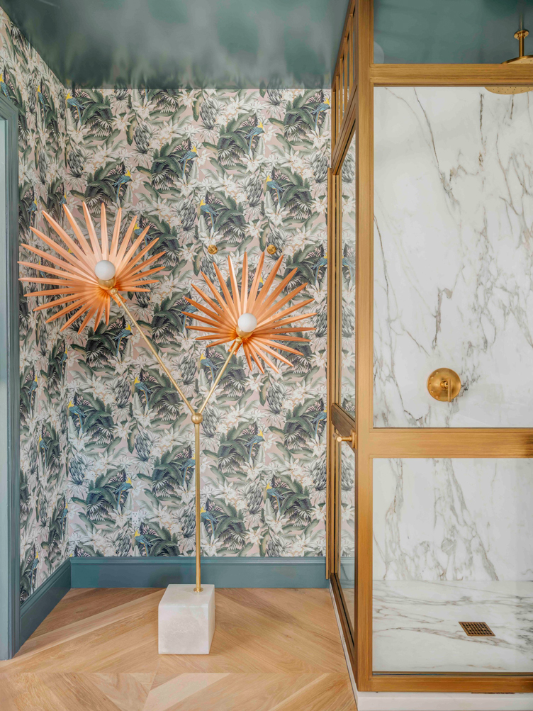
Space wasn’t necessarily on Julie’s side in this guest bath, not that you’d know it from looking at it now. “The architectural challenges were a tight space and nothing was salvageable,” says Julie. “I ended up bumping out the shower so it didn’t feel so tight. Since this is a guest bath that isn’t getting everyday use, I felt it was appropriate to do a single sink, with additional counter space off to the side.” Since lighting was also an issue— “It doesn’t have a lot of natural light, especially on those gray San Francisco days”—the one bit of unoccupied floor space was doled out to a floor lamp. While it might seem like an unusual choice, the extra light more than makes up for the space sacrificed. It also makes it clear the room doesn’t take itself too seriously—a hallmark of any self-respecting French design.

The Walls
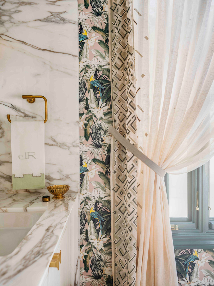
Continuing her playful pairing of classical elements and modern ones, Julie chose to clad fifty-percent of the room in marble and fifty-percent in a quirky, tropically-inspired Pierre Frey wallpaper. “When I saw the paper I just knew it was the perfect complement to the marble, the gold accents, and the wood floors,” says Julie. “I loved the colors and the tones of it. It has a whimsical undertone, but still feels sophisticated. I have to hand the credit to Pierre Frey on that one. When you look at it closely, it has an artistic and dimensional quality.” While Julie may be handing it to Pierre, we have to hand it to her. Despite both the marble and wallpaper being incredibly busy visually, the two work together like a charm, with no hint of clashing.
Get The Look
Product_id 1676984 not found
Product_id 1317416 not found
Product_id 1380540 not found

The Lighting
To make her bathroom feel like a proper room, Julie employed a total of three different kinds of lighting: overhead lighting, sconces, and that aforementioned floor lamp. “The palm floor lamp is a work of art,” says Julie of her most unexpected choice. “We had a bit of dead space in that corner, and I came across the hand-cut fan palm fixture by the studio Rosie Lii in Brooklyn and had to have it.” While the floor lamp mirrors the modernity of the overhead flush mount, Julie opted for vintage-inspired brass shell sconces above the vanity. “I am a huge fan of Soane Britain and I have always loved these shell sconces. Their finishes are gorgeous. A plus, since I needed a finish with dimension to work with the brass shower enclosure. They also reflect light so beautifully and really highlight the marble.”

Get The Look
Product_id 1749011 not found
7 Bath Elements, 7 Bits of Pro Advice
Here, Julie gives ingenious tips and ideas that can be applied to just about any bath.
LAYOUT
“Really think about how you want the space to feel and function. Paying attention to size, scale and natural light is really important. Envision yourself standing in the shower or in front of the vanity. Think through how you want these key elements to function for you. Start with the bones and the space planning and then move to the decorative. It’s essentially a recipe and it takes time to achieve the finished product.”
FLOORS
“The wood floors were used to anchor the space and keep it from feeling too cold. Wood is quite durable. We do them in homes and commercial spaces, so I figured why can’t we use them in a guest bath that’s not getting used every day? With tile on the floor you have grout lines and you have the dirt factor to think about. Wood is easy to clean and if it becomes scratched and worn you can sand it and re-stain it, too.”
SHOWER & VANITY
“The marble was my focal point and I wanted to carry it from the vanity to the shower. I wanted to have it read as one clean, consistent surface. Also, I wanted the room to feel bright and more expansive. I did not want a lot of grout lines breaking up the space, so I book-matched the corners of the marble in the shower and in the corner above the vanity so the veins would read consistently. “
INSTALLING STONE
“I think the key to executing successful stone installation is planning on the front end before installation. Also, perfecting the layout templates and indicating your bevel sizes. Also, symmetry is really key. Especially here with inset panels, getting the sconce backplates to sit nicely within the panels, the list goes on and on. I will say the other key tip is your fabricator. I had an amazing fabricator who was able to take my direction and execute the installation of the marble.”
MIRRORS
“I wanted the vanity to feel classic with a kick. To make that happen, I pulled back with the mirrors and did simple inset mirror frames instead of decorative mirrors above the vanity. I wanted the marble to be the star and didn’t want a decorative mirror to detract from that.“
STORAGE
“I didn’t see the need for two sinks since this was a guest bath. However, I wanted to maintain the symmetry of the vanity and marble insets. I felt it made more sense from a user standpoint to have one sink and to keep more counter space. I designed the vanity functionality around that aspect as well. You have more storage when you don’t have to design around sinks and plumbing.”
ACCESSORIES
“We wanted to keep the accessories to a minimum and not overwhelm all of the other details. I knew the vintage French blue opaline turquoise vases from Found by Maja on Sacramento Street were just the thing to provide height and showcase our florals. From there we sprinkled in a few additional curated vintage pieces to give the space a chic stamp.”
Get The Look
Product_id 1130463 not found
All images by Christopher Stark


