Okay, “let’s take a shelfie” isn’t exactly the most common phrase on social media (that would be “like and subscribe” or “link in bio”). However, there’s more than enough design inspiration out there to delight, surprise, and well, confuse the public when it comes to shelf styling ideas. How matchy-matchy should you get? How much is too much? And when is it okay to incorporate actual books on a bookshelf (an outrageous thought)?
To get to the bottom of these meticulous matters, we spoke with 11 designers about their favorite shelf styling ideas. Their varying approaches — and equally lovely results — can offer some tips for home decorators of all stripes. See what they had to say below and get some ideas for the next time you tackle those delicate displays.

Mix Your Materials
Colorful covers and spines help books compete for attention at the bookstore, but they don’t always coordinate when displayed on someone’s shelves. Gideon Mendelson handles this problem not by trying to limit the colors or types of books, but by introducing more neutral, textural elements as a type of palette cleanser. Mendelson explains, “we love when our clients have their own collections of books — these types of collections tell a story of who lives in the home. However, these books often have jackets or covers that tend to be very colorful, so we want to style the shelves with additional collections that are more consistent colorwise. Here, we used mid-century ceramics in a white glaze. The focus stays on the form of the ceramics — they don’t compete with the colorful arrangements of books. The mix of the two — the books and the ceramics — looks and feels balanced.”

Mix Vintage, New, and Natural
Lauren Gregory of Southern California-based DACHA is a big believer in finding the right mix of pieces. These can be old, new, or even natural elements gathered together in an artful way. “When styling interior spaces we always go for layers, texture, mixed materials, and natural elements,” Gregory says. “Shelves offer a great opportunity to showcase the pieces that bring a room to life — art, objects, personal treasures, plants, books, etc. We love to mix vintage objects with more modern pieces to keep the vibe feeling contemporary. Incorporate natural elements (seashells, feathers, crystals) for an unexpected touch. Add depth and texture by layering beads, baskets and leather items. Use books, trays, and boxes to ground a collection of smaller items so they don’t get lost. And of course, green plants make every space come alive!”

Embrace Your Interests
As many of our designers can attest, bookshelves aren’t just for books. There are plenty of pieces that can decorate your walls and express your interests — even if those interests include gin and vermouth. Chris Goddard of the Goddard Design Group describes his shelf styling ideas for a single male client: “Floor-to-ceiling bookshelves create a focal point for this cozy sitting area in a bachelor’s penthouse we designed. With a fossil stone fireplace, we wanted to create a curated vignette that tells a story and illustrates our client’s personality. Cocktail hour is a set time in the penthouse, so we scoured everything from antique stores to online auctions in order to pull together a large collection of vintage cocktail shakers. The mix of barware and antique books adds a whimsical yet masculine touch to the space.”

Create a Cohesive Display
Designer Brynn Olson likes to design a unified look for clients’ shelves, but utilizing many different types of pieces, including books, antiques, and varied textures. As she explains, “creating beautiful designs with your shelves all starts with you and what you love. In order to keep the look sophisticated, our formula usually consists of beautiful neutrals, natural stones, and metals to keep the vibe soothing and uncomplicated. Stacks of books are always a must and we encourage a curated yet collected vibe in the arrangement. If you want to display a beautiful antique brass urn you picked up in your travels, we always counter that beautiful metal on another shelf so visually the pieces feel cohesive.”

Edit, Edit, Edit
This was a common theme among the designers we spoke with: It’s vital to select the pieces that work and edit out those that don’t. For Penny Francis of Eclectic Home, this means working with her clients to make sure their favorites are represented, but in a tasteful, well-designed way. “This client had an abundance of photos, books, albums, and decorative objects from travels,” Francis says. “Editing was key. We alternated how the books were arranged on the shelves — some laying flat, others standing. Separating the books we placed objects, photos, and art. It created more visual interest for the shelves and allowed the clients to better appreciate their collections.”
Dress to Impress
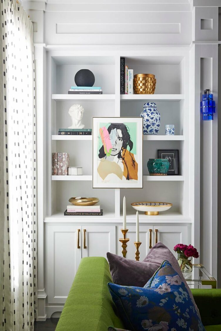
Sometimes designers actually have the opposite issue to contend with — lots of display space, and not enough pieces to fill it. Summer Thornton says it’s essential to find the right balance when devising shelf styling ideas. “There’s nothing worse than naked bookshelves, except perhaps ones sparsely decorated with a few tiny items,” Thornton says. “But if done right, a well-styled bookcase can enhance the style and add personality to the room. I usually incorporate a variety of vessels, sculptures, bowls, and books. That helps break up the symmetry and repetitiveness of each book case cube. Find some beautiful things you love with a variety of shapes and colors, and just go for it!”

Put Art Front & Center
In instances where you can’t edit the book selection (or if a client simply can’t part with a single title), consider artwork in front of the shelves to draw the eye and add some unity. That’s what Courtney Coleman of Brockschmidt & Coleman did with this overstuffed shelving space. “There may not be much room for styling within the shelves if every available space is cram-packed with books,” Coleman says. “ But small, easily removable artwork hung in front of the books is a way to layer and give interest. The artwork can work with the divisions within the shelves or can relate to moveable furniture also placed in front of the bookcases. If there is a bar in front of the books, that’s a good, active way to introduce some other interesting titles to your guests.”

Find the Right Balance
For Tineke Triggs of Artistic Designs for Living, it’s important to balance shapes, sizes, and different types of objects while also ensuring that the client’s interests are reflected. “Choose items with different heights to create a visual balance,” Triggs says. “If using books, make sure they relate to the homeowners’ interests. Don’t choose design books if your client is more interested in vintage cars than home design! I use books sparingly, and if they’re stacked horizontally, I’ll often add another layer of interest by placing a smaller object on top. Once everything is in place, stand back and see when your eye is drawn. Then edit, edit, edit! That final edit is perhaps the most important part of styling bookshelves.”

It’s a Go for Groups
When organizing books (or any other items on shelves, for that matter), consider the ways you arrange multiples and try to get creative. That’s just what Rebecca Cox of Lily Spindle does. “Arrange books both vertically and horizontally to keep things visually interesting — also, a short stack of books creates the perfect spot for a wonderful ceramic vessel or sculpture,” Vigna says. “Freestanding pieces of varying heights and shapes, such as colorful, patterned pottery, commingle really well with framed photographs and paintings. And, when in doubt, make strategic, intentional groupings of pieces, whether it’s multiple bottles of your favorite liquors, or even your one-of-a-kind Pez dispenser collection.”

Practice This Poem
We give major points to Chloe Warner of Redmond Aldrich for creativity when it comes to shelf styling ideas. She actually developed a rhyming scheme to help you remember how to put together a beautiful display. As Warner puts it, “Four up, four down, objet, air, go to town! What this means is: If you are just starting, put a brick of books spines up, then put a few books lying flat, pick an object, compose some space around it, then repeat.” A rhyming poem to help you design… we think that’s just fine.
Feature Their Favorites
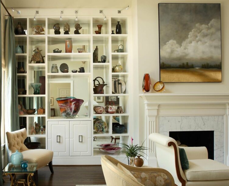
Of course, no display is complete without personal touches and beloved art from clients. For this home in Atlanta, designer Maria McLaurin had to devise ways to include her clients’ favorite pieces in a manner that also worked for the space. “One of the challenges of this Atlanta client’s project was to incorporate an extensive art collection,” McLaurin says. “During the renovation of their newly purchased home, we replaced traditional, arched built-in cabinetry with custom contemporary shelving backed with mirror for displaying the homeowner’s assortment of hand blown glassware and sculpted pieces. Adjustable lights were strategically placed to highlight the beauty of the glass.”

Remember Your Angles
For designer Matthew Caughy, arranging the right shapes is key to developing shelf styling ideas, as in this modern apartment. “When styling a bookcase or shelves, it’s important to group like items and place them on the diagonal for your eye to find,” Caught says. “Also, be sure to stack books both vertically and horizontally throughout the vignette to create movement and interest.”


