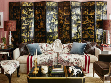
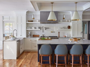
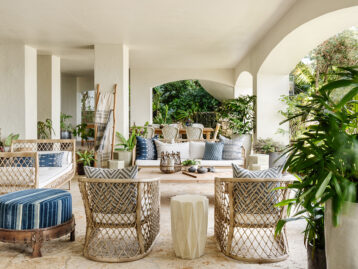
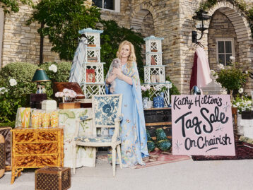
With a fresh take on traditional styles, Caroline Gidiere brings a modern energy to the design scene in Birmingham, Alabama (a city that’s become a hotspot of Southern design in its own right). Her studies in Paris and a life of European travel have given her an appreciation for the classics in her work—including plenty of antiques, our absolute favorite, of course—and her designs have been featured everywhere from Veranda to Luxe and House Beautiful.
We spoke with Caroline about her updated take on traditional, her expert use of antiques in all of her work, and why Birmingham is the important design city that it is. See what she had to say, and check out her carefully selected, artfully curated cut of Chairish picks below.
Shop Caroline Gidiere’s Chairish Favorites >>>
Shop Caroline Gidiere's Chairish Favorites
Product_id 12334961 not found

You’re known for having a modern take on traditional interiors… tell us a bit about that. What are some of the ways you blend the two?
I guess a modern take on traditional is just a better way of saying “traditional that looks fresher than you would think.” The last time we all saw traditional design in the States, it was very precious and maybe a little saccharine sweet and overly feminine. It’s not surprising this eventually caused us all to tip over towards the sleek, austere and angular in the 90’s. Now that we are once again returning to “traditional,” we need something that holds the two in balance, where the flounce and flourish of traditional is balanced with the clean edges and simplicity of more modern pieces.
Tell us about your approach to vintage and antique finds… How does that come into play when it comes to blending modern and traditional styles? How do you like to incorporate them?
For me, rooms without vintage and antique pieces lack soul and can be uninteresting. You can only go so far with the pieces that come off the manufacturing lines. If everything is new and shiny, the room invariably hits one note and can end up looking like a hotel lobby or guest room. And, sometimes, our personalities only enter the space through antique or vintage pieces. I don’t have a formula; my approach is very organic, brought about by the boundaries I am working within. Also, sometimes it’s a question of budget. Antiques and vintage can be much less expensive than new or custom, if you know what you are looking for and if you have a local furniture guy who can paint, strip, or stain a piece (or perhaps you just need to replace an enigmatic stone top with something more quiet). We turn to Charish on the reg to help us meet budget and make it sing!
Shop Caroline Gidiere's Chairish Favorites
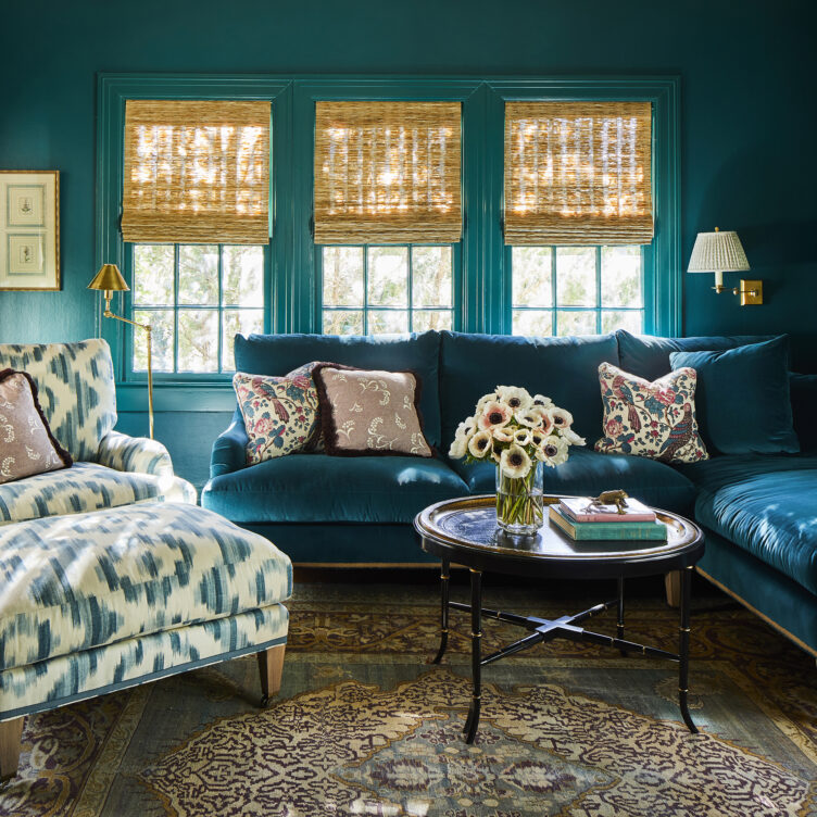
You use some truly elegant color combinations in your work. What are some of your current favorite pairings? And are there any colors or combinations that you tend to avoid?
We are currently working on a house for a British couple who loves color, so we used several really exciting and beautiful color combinations in different rooms like pale peach and dark, bottle green in the kitchen, aqua and bright yellow in the sitting room, and deep salmon and sage green in the study. These are all combinations I hadn’t used before but I have been delighted with. Just about the only color combination I abhor is what I call “ketchup and mustard” but I never say never. My mind is always open to possibilities!
You’re based in Birmingham, which has become a real hotspot for design. Plus we’re big fans of Antiques at the Gardens at the Birmingham Botanical Gardens! How has the scene in the city evolved over the years? And what would you say are some trademarks of Birmingham style?
Birmingham used to be a hub for shelter magazine publishing, so it has always kept its finger on the pulse of design. During its publishing heyday in the 90’s, the greats like Bobby McAlpine, Betsy Brown, and Bill Ingram really influenced the Birmingham design scene (and the rest of the country), with a departure from staid, Southern traditional toward more contemporary Belgian design of the likes of Axel Vervoordt and John Saladino. The trademarks of that style still linger—you can still easily find a very neutral color palette, unvarnished wood, and modern lighting in most corners of town.
Shop Caroline Gidiere's Chairish Favorites
Product_id 10173465 not found
Product_id 12348354 not found

You attended school in Paris and have traveled all over Europe. How has that influenced your approach to design? And do you have a favorite place in Europe?
Paris will always be my favorite because it’s familiar and there’s a bit of nostalgia for me, but I love traveling all over Europe and discovering it anew with a more mature eye (and one keen for interiors). My love of France and traveling in Europe has really influenced and inspired my use of antique furniture. I’m often so blown away by the age and beauty of pieces and how long the Europeans have been at the game of finely domesticating their interiors. It seems to me that Europeans employ fabulous antiques because it is literally what is most commonly available. Usually, what’s in Grandma’s attic is an incredible period piece that has been handed down. Stateside, we depend on Chairish for that!
Finally, what would be a dream project for you and why? What’s something you would just absolutely love to design?
I am always up for the challenge—new places, new spaces, it’s all so fun and rewarding for me—if there is a great client with a great budget, I could be talked into just about anything! But, for whatever reason, I have always wanted to design a boutique hotel, maybe in Europe. I’m intrigued how smaller luxury hotels, like Kit Kemp’s Firmdale Hotels, are moving toward making a hotel feel like home. (Funny, too, because so many clients want their bedroom suites to feel like luxury hotels). I suppose the challenge for a hotel is to provide that cozy, safe, and comfortable feeling for a broad spectrum of people. Of course, antiques and vintage would play a huge role in that!
Shop Caroline Gidiere's Chairish Favorites

On Chairish & Vintage Shopping…
What do you find most compelling about Chairish?
The breadth of offerings and the facility in acquiring them!
How does sustainability factor into your design choices and love of vintage?
Not only do antiques and vintage pieces make rooms better, but we are better for using them. This is the best part of Chairish to me! When we don’t have to cut down any trees or use any plastics or dyes, we’re winning! The easiest way to reduce our carbon footprint is to reuse and repurpose pieces. The easiest way to do this with the widest selection, for us, is Chairish.
Are there any dream vintage/antique “gets” you wish you could have?
I dream of a set of Pierre Barbe table lamps from the ‘70s. I bid on several different lots in the Givenchy Estate Auction at Christie’s and was unsuccessful. I keep hoping I’ll run across a pair (or two) somewhere, sometime.
What are three of your favorite pieces on Chairish now (please include links)?
I love this pair of eagle consoles by Sir William Kent; this Billy Baldwin étagère with green lacquered shelves; and this Charlotte Perriand Free Form dining table (which I would use as a desk).

Some Design Favorites…
Favorite way to create a statement-making moment in a room:
Draping the room in a single fabric (furniture, walls, and drapery). I first saw this in the houses of Carolina Herrera (and, later, her daughters) and fell madly in love. Then I learned this “à la française” technique is, as the name suggests, taken from the French style during the 18th century. You literally cannot go wrong (so long as you choose a fabric that you love!).
Favorite decorating “cheap thrill:”
Rattan or wicker. It’s inexpensive but it instantly adds warmth, depth, and character to a space.
Favorite iconic piece of vintage design:
Jean Michel Frank Apartment desk. Perfection, chic, goes in any room.
Favorite paint color:
Right now, my favorite is Edward Bulmer’s Jonquil.
Favorite piece of decor in your home:
My Charlotte Perriand rush dining chairs.
Favorite designer or artist from the past you most often turn to for inspiration:
Frances Elkins, Daniel Romualdez, and Hubert de Givenchy
Favorite style icon:
Hard to choose just one. Phoebe Philo, LSD, and Carolyn Bessette Kennedy are the top three.
Design destination every creative should visit at least once:
Hotel de la Marine at the Place de la Concorde in Paris.
Best piece of career advice you’ve ever received:
Keep your overhead low so that you can make recommendations to clients based on what’s best for them (and the design) instead of what’s best for you.
Shop Caroline Gidiere's Chairish Favorites
Product_id 3899206 not found

Some Lifestyle Favorites…
Favorite vacation destination:
Paris
Favorite hotel that’s inspired your work while traveling:
The Place, Florence, Italy, has probably influenced me more than any other hotel recently. It was really a quiet luxury moment for me. The sheets, the china, the color palette, the details.
Favorite restaurant:
L’Orangerie in Gordes, France
Favorite small museum:
Favorite podcasts:
The Toast, Smartless, and Wiser Than Me
Favorite Instagram accounts to follow:
@scott_stirewalt, @growingthoughts, and @maison.carlyle
Favorite hostess (or thank you) gift:
Favorite flower:
Lilac
Favorite adult beverage:
Currently, a Ranch Water: tequila, fresh lime juice, and sparkling water
Favorite way to unwind at home:
Watching TV with my family (it used to be cooking but Covid ruined that for me. Still a little PTSD in the kitchen…).
Favorite entertaining essential:
Bamboo flatware and silver wine goblets: very versatile.
Shop Caroline Gidiere's Chairish Favorites
Product_id 4856718 not found
Lead photo: David Hillegas


