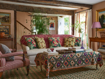
Classic, subdued, and infinitely livable, neutral shades are the reigning crowd-pleaser when it comes to paint. Designers, armed with an arsenal of the best neutral paint colors, are the ultimate source for what works, so we decided to uncover the specific hues they use so the rest of us can skip the whole trial and error bit and roll straight to perfection. From creamy white to grey to those lovely multi-hyphenate hues (gray-green anyone?), here are seven stunning neutral colors to consider.
Pair It With...
Product_id 1857043 not found

Designer: Eche Martinez
Paint Pick: “For neutrals nothing beats Benjamin Moore’s Rodeo. It’s a great backdrop that’s just timeless and elegant.”

Designer: Lindsay Lane
Paint Pick: “I tend to use a lot of white. Benjamin Moore’s White Dove is usually the best in any circumstance.”


Designer: Ashley Whittaker
Paint Pick: “We’re all about camouflage green in my office these days; we’re treating it as a neutral. Camouflagey-green looks great with furniture, with art, with everything! It has enough grey in it that the color is not overpowering. Benjamin Moore’s Camouflage is our tried-and-true.”

Designer: Jenny Wolf
Paint Pick: “Farrow & Ball’s Cromarty. It’s a soft gray/green that is very soothing.”

Designer: Richard Ouellette
Paint Pick: “I love color, including color on upholstery and décor elements, but I prefer Benjamin Moore CC-30 Oxford White for walls. Warm white elevates any architectural element, corrects any fault in a space, and gives everything a fresh gallery feel.”


Designer: Erin Gates
Paint Pick: “Benjamin Moore’s Wind’s Breath for an all-over color—a great neutral that isn’t too tan or too grey.”
Pair It With...
Product_id 1734747 not found

Designer: Pierce & Ward
Paint Pick: “Retreat by Sherwin Williams. Paint colors can be tricky, and this one works in any space no matter the lighting.”
10 White Paint Colors Designers Swear By >>
Lead photo by John Merkl


