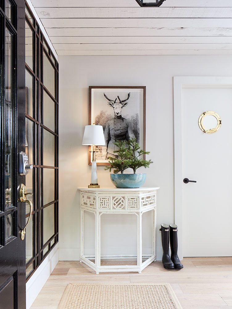
If you’re going to purchase a “very ordinary suburban house,”—as interior designer Benjamin Dhong calls his wine country retreat—you’d better have an extraordinary aesthetic. Dhong, a self-described and bona fide “mix master,” was just the man for the job. When he took ownership of his 1,700-square-foot home in Healdsburg, CA, a charming hamlet in northern Sonoma County, “it was downright ugly,” he says. Through its generic bones, he envisioned a modern farmhouse, with wine country panache.
The first step was to open up the kitchen’s flat ceiling, which exposed a beautiful vaulted ceiling for an instant dose of that farmhouse feel. Then the walls between the kitchen and dining room came down to produce an open living/dining area. The next phase was what the designer calls “de-suburbanization.” In came new wood floors and wide-planked ceilings to give it more of a true farmhouse feel. Out went the bi-fold doors. See how Benjamin Dhong used some ingenious hacks and his amazing design eye to create one stunning retreat.
SHOP BENJAMIN DHONG’S WINE COUNTRY LOOK >>

Get the Look
Product_id 794946 not found Choosing a Theme
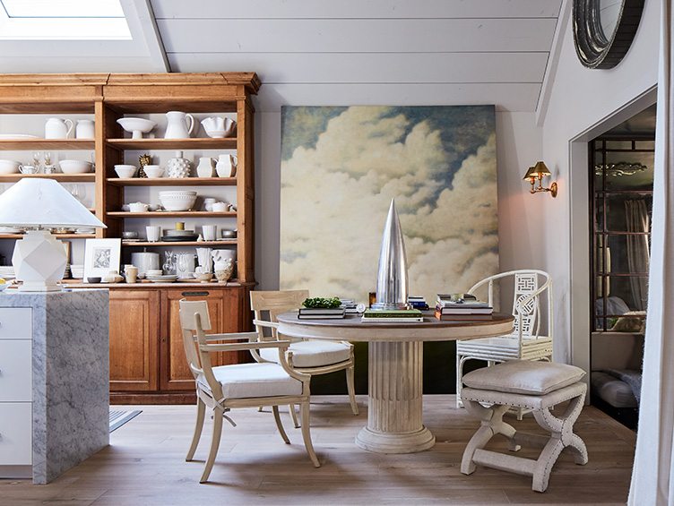
One of the home’s greatest focal points, a cloud-shaped piece that hangs over the living room fireplace, was Dhong’s own creation—with a little help from Salesforce. With a cloud oil painting in the dining room and a leftover roll of Fornasetti’s Nuvolette wallpaper, he decided to create an atmospheric theme by wallpapering a piece of plywood with the cloudy engraved print. “I was thinking I would do an iconic art cartoon shape, and then I thought, ‘Why not just grab Salesforce’s logo?’ They must have paid hundreds of thousands of dollars for the perfect cloud.”


Get the Look
Product_id 753478 not found Nailing a Neutral Palette
In addition to a literal cloud theme, Dhong’s home also has an airy, billowing feel to it. “We nicknamed my home ‘The Cloud Walk’ just because you feel like you’re in the clouds. It’s a very serene and special retreat,” the designer says. A predominantly neutral palette and layers of cozy textiles contribute to this aura. “People think neutral means something has to be boring, and that’s the furthest from the truth,” Dhong says. “If you layer enough neutrals in different textures and materials, it’s amazing how nuanced it can be.” The designer sourced lots of wonderful bamboo pieces, including stools and chairs, from Chairish. “I was able to paint them and it transformed them. It was great for me,” he says.

Get the Look
Product_id 624703 not found Adding Major Character
The overarching challenge was to give the space a sense of spirit with inexpensive materials. “You’ve got a big house that doesn’t have a lot of character at all, and you’re trying to figure out how you can give it authenticity on not a huge budget,” Dhong says. A coup in this battle came when Dhong discovered a 19th century French apothecary case piece at an antiques shop in Healdsburg. “I didn’t want the kitchen to feel like a kitchen because you could see it from the living room,” he explains. “This basically makes the space, and makes it feel more like a library.” Faced off by a sleek modern island encased in a block of Carrara marble, the bibliotheque-esque cabinet is elegantly juxtaposed.

 Pairing Old and New
The combination of the antique apothecary case and a sleek marble counter is a perfect representation of Dhong’s design style. “I love both history and modernity at the same time, so I love blending the two together,” he says. “I would say that I’m a great mix master of different styles in a way that’s harmonious.” To achieve his mix-and-matched look, the designer sourced unique vintage furniture and decor heavily from Chairish, as well as a wide-variety of non-custom retailers like Restoration Hardware, IKEA, West Elm, and CB2. The majority of the designer’s beautiful collection of white pottery was sourced over the course of two or three weekends, driving up to Healdsburg and stopping off at Marshall’s and TJ Maxx. “I knew that I wanted mostly white with little small shifts, so I found fantastic things and I pieced those all together. Then, over time, you add a few things here and there,” he says.


F
armhouse
 Stealing Extra Space
The designer balances his time in Healdsburg “chilling” by himself with days and evenings entertaining. Thanks to his thoughtful design, with lots of chairs, daybeds, and even a Swedish sleeping alcove in the kitchen, the house can actually sleep 11 people. Stealing 40” from his garage, Dhong had the alcove built beside his dining area, as another place someone can sleep or lounge. “I’ve always wanted what I call a Swedish sleeping alcove. When you’re in these charming Scandinavian farmhouses, you would have an alcove that someone might sleep in next to the kitchen, maybe because it’s warm.”


 Giving Good Guest Room
Though the designer used a very neutral palette, he was thoughtful about distinguishing each room from the next, and bringing its own character to life. “For the guest bedroom, I wanted it to be very reassuring and sort of a throwback to family summer vacations. Maybe you’re at the lake, someplace where it’s a little older, and things are very polished.” To that end, he used a yellow quilt with a country feel and an antique portrait in a regal gilded frame.

 Adding Dramatic Details
In his own bedroom, Ben wanted a dose of drama. The designer played into the suburban home’s double-height ceiling with a canopy bed, which he had cut and made even taller. Beside it, a set of metal floor mirrors creates a dramatic backdrop and provides a sense of architecture. The designer admits he has an obsession with mirrors—one “that comes sometimes from practicality.” “Rooms without mirrors are just a little flat,” he says. “Rooms come alive because you’re suddenly seeing everything through a different prism. It brings magic into a room.”

C
Product_id 672981 not found[/chairish_product_grid]
hic A bona fide mirror buff, Dhong says his philosophy behind mirrors is that they serve the purpose of art, like in this hallway vignette.
 Designing the Perfect Den
Those same metal floor mirrors supplied another strike of magic to the home’s former enclosed porch and what Dhong now calls “the opium den.” The space, previously used as an office, was in bad shape. “I painted everything a dark gray to make it all disappear, found an inexpensive over-dyed carpet and outdoor daybed, and again, my mirrors,” he says. “I screwed in a starburst mirror on the ceiling to give it that opium den sort of fantasy.” Though it’s a small space, it’s become everybody’s favorite place to gather and squeeze in for cocktails, as well as the daily venue for his morning tea. Like the rest of his home it’s remarkably inviting, as wine country should be.
Look out for more of Benjamin Dhong’s work in the upcoming book House Beautiful Style Secrets, to be released this month by Abrams.
SHOP BENJAMIN DHONG’S WINE COUNTRY LOOK >>
Benjamin’s Healdsburg Favorites
SHOP
Shed
“This modern grange is the chic place to pick up homewares or food and wine for a picnic. It’s a market, café, and a great place to just grab a coffee at the bar.”
EAT
SingleThread Farm – Restaurant – Inn
“Just opened, SingleThread has earned buzz from NY Times and Vogue, making it one of the most anticipated new restaurants of the year. I love its Californian-and-Japanese inspired food and rich interiors.”
Alexander Valley Bar
“The place to chill after a day of wine tasting. Far from the crowds, this is a relaxing place to nurse a seasonal cocktail amongst the vines.”
SEE
Healdsburg Plaza
“What’s an ideal small town without its square? Healdsburg square is justifiably the best town square in the state. Picnic on the grass, people watching, listening a concert…it’s a welcome break from the urban rush!”
Photography by John Merkl, Styling by Jody Kennedy, Written by Julia Millay Walsh


