Whether it’s a Shingle-style stunner in Bridgehampton or an all-glass oceanfront home in Malibu, a beach house is a dream for every design lover. But if you’re lucky enough to make it happen… then what? How do you decorate a beachfront or waterfront home so that it’s personal, unique, but also fully focused on those incredible views?
Fortunately, we reached out to 11 talented designers and architects with all the right experience to help us with exactly this champagne problem. Below, read their tips for making the most of every room in a fabulous beach home, whether you’re designing your dream kitchen or a restful waterfront bedroom. You’ll want to hear those waves lapping — not those patterns clashing.

Seating Where You Can See
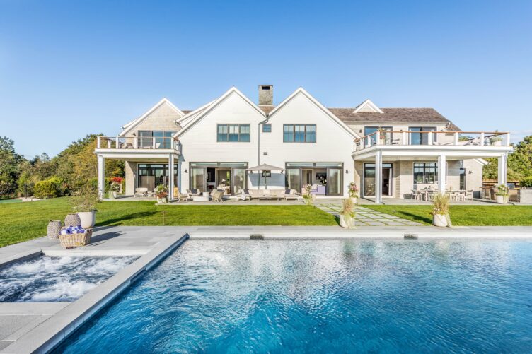
If you’re fortunate enough to have a beachfront or waterfront home, the first thing you’ll want to do is maximize your views and your entertaining options. If you’re blessed with space, make the most of it with a mix of seating areas for guests, as Hamptons-based designer Katie White did here. “This outdoor space, along with the house itself, was designed to maximize the vistas of the preserve facing west behind the property,” White says. “We created multiple seating areas for dining, lounging, or conversing by the firepit that can all be enjoyed while taking in the incredible view.”
Shop the Style
Product_id 3302153 not found

Extend Your Spaces Outward
One of the key things we heard from designers and architects alike was the importance of integrating indoor and outdoor spaces so the flow is seamless between the two. Michael Lomont of Stelle Lomont Rouhani Architects highlighted that when it came to developing this stunning home and its view-filled dining and living spaces. Lomont says, “Incorporating floor-to-ceiling glass, continuing the ceiling material through the roof overhangs, and having similarly colored material on the floors extends the indoor spaces outward, accentuates the view, and makes smaller spaces feel much bigger. The overall design and materials chosen for this home remind us of what we love at the beach: places to be in the sun or shade, natural hues, and simple, weathered and textured surfaces.”

Viva la View
When it comes to bedrooms, the rules are the same: highlight the views and let them take center stage, as in this main bedroom with a wraparound terrace, designed by Annie Santulli. “Waterfront properties come in all shapes and sizes, but one thing they have in common is oversized windows showcasing the view,” says Santulli. “In this contemporary Palm Beach apartment, each space had a full wall of windows that were full of bright blue ocean and very little else. Because there were no neighbors in sight, we chose to add Mylar to the exterior of the windows and no interior window coverings at all. Care was taken to select items that added texture and interest without trying to compete with the view.”

Complement — Don’t Compete
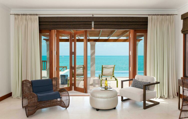
It can be tempting to fill a beachfront space with whimsically colored pieces, but the smarter move is to keep things natural and let the water views take center stage. This is particularly true if you’re in, oh, say, Turks & Caicos, as is the case with this gorgeous space by LKID. Designer Lisa Kanning explains: “The color palette for this beach residence was selected to complement the tones of nature outside and not compete, allowing the spectacular glistening turquoise color of the sea to take center stage. Natural woven materials add depth and textural interest to offset the sleek lines of the metal furnishings, with warm wood tones completing the look.”

Embrace the Space
As with any project, one of the first things designers of beach homes need to do is study the layout of the spaces to understand them inside and out — quite literally. That’s what Dorothee Junkin of DJDS did when designing this masterful minimalist kitchen in Vero Beach, Florida. “Designing homes along the water always comes with a very specific spatial dynamic,” Junkin says. “I often like to sketch view and flow diagrams over our layout studies to evaluate view directions and frames as well as how the interior and exterior spaces will be connected. Blurring the line between the interiors and the exterior allows us to create a seamless indoor/outdoor experience.”

Let In the Light
Similarly, designer David Scott wanted to amplify the link between indoors and out when creating this kitchen in the Hamptons. He chose light-colored cabinetry, surfaces, and pendants to make that connection abundantly clear and allow his clients to seamlessly move between spaces. Scott explains, “For this Southampton kitchen, light sand-colored cabinetry in a high gloss lacquer amplifies the natural light and echoes the beach. Repeating the same simple globe pendant lighting allows your sightline to continue right out to the view. The afromosia wood wall continues from the outside in, amplifying the connection to the beach.”

Keep a Low Profile
Scale is everything when designing an interior, and beachfront homes are of course no exception. Santa Monica-based designer Sarah Barnard recommends selecting furnishings with lower heights that don’t compete with the star of the space: those water views. “When selecting furniture for a waterfront home, choosing low-profile pieces with minimalist silhouettes leads the eye to exterior views,” Barnard says. “With minimalist furniture, beauty becomes about the quality of the materials. Investing in natural, sustainable materials that make your heart sing will keep the pieces feeling exciting. Selecting a color palette for the interior pulled directly from the exterior view creates a harmonious transition to the outdoors, making the home feel like an extension of the natural environment.”

Bring In Beachy Colors
Whether you’re a fan of more subdued interiors or something a bit more maximalist — and hey, you’re reading Chairish, after all — you can bring in natural colors to create a connection with the outside world, whether you want the dial turned to 1 or 100. Designer Gil Walsh kept exactly that in mind when devising this whimsical waterfront home in Florida. “We created this seaside getaway using classical beach and nautical motifs in fresh, modern applications,” Walsh says. “The inspiration for this scheme started with the orange accent chairs that I discovered at a flea market. With a crisp, white backdrop for maximum airiness, we wanted to use punches of strong color to create bold graphic statements.”

Take Cues From the Views
Designer Shannon Ggem takes a similar viewpoint, letting nature be her guide when it comes to palette and furniture choices. After all, if you have a home at the beach, don’t you want to remember exactly where you are? “When designing beach homes, I love to take color cues from the views,” Ggem says. “This home is right above tide pools that have starfish and mussels in all the colors you see represented. And those bird lamps! I love to support an incredible view with fun, figural reference to the surrounding environment. Beach home clients are nature lovers, so why not celebrate it?”
Shop the Style
Product_id 2629403 not found

Mirrors Can Work Magic
And when it comes to maximizing views that could be even more stunning if they were a bit more expansive, nothing works quite like a mirrored wall. That’s exactly what designer Tracy Murdock did in this luxe, modern space. “For this gorgeous townhome on Billionaires’ Beach (Carbon Beach in Malibu), we worked to make up for the ‘tunnel view’ in the long, narrow floorplan,” Murdock says. “We added a full length mirror next to the window, which substantially widened the view ‘perception’ in the space.”
Shop the Style
Product_id 3305566 not found

An Open Door Policy
Finally, if you’re lucky enough to have a home on the water, open up your spaces as much as possible — literally. For designer Jackie Armour of JMA Interior Design, this meant taking full advantage of the architectural layout of this Florida home. “This ‘modern casual’ home is in Jupiter, with magical views of the waterfront, lush landscaping, and a private golf course,” Armour says. “The home’s open concept has a great room running its length, which is perfect for soaking up the natural light. When fully opened, this room seamlessly blends the outdoors with the indoors, creating easy access to the home’s luxe outdoor entertaining spaces.”
Shop the Style
Product_id 2067945 not found
Product_id 3251375 not found
Lead image by Robert Brantley Photography; design by Annie Santulli.


