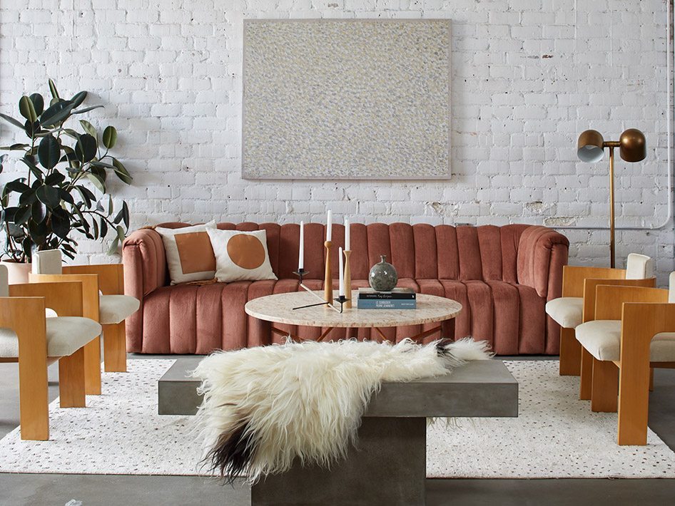
The first thing you notice when you step inside Light Lab, the creative studio and event space in L.A.’s Atwater Village neighborhood dreamed up by Anne Sage and her partners Jayden and Caroline Lee of Woodnote Photography is well, the light. Warm California sunshine streams in from two massive skylights, filling the nearly all white interior with a certain glow.
Anne, a well-known blogger, creative consultant, and much-followed Instagrammer opened the bright, airy warehouse last year as the “perfect blank canvas” for photo shoots, launch parties, workshops, and pop-ups, not to mention a creative laboratory for her own design and entertaining stories. Get to know this design darling, tour her creative hub and shop the killer collection of pieces she and fellow design powerhouse, Martha Mulholland, have curated just for Chairish!

Shop Anne & Martha's Collection
When did you first get the design bug?
“I was five and my mom was redecorating my bedroom. This is the late 80s so it was floral Chintz everywhere. We went to Laura Ashley and picked out pink and white striped wallpaper and painted the bottom half of the walls a matching shade of rose. After working in PR and advertising out of college, I started my blog in 2008, in part because I thought no one would hire me at a design magazine.”
What was blogging like back then?
“A year after starting the blog, the community really started to gel. We were doing it because we loved it. After two years, I reached a point where all of the content on my blog started to feel iterative. I was using other people’s photos and talking about their work. I wanted to create my own and create a platform to collaborate, that’s when Rue was born.” (Anne cofounded the online design magazine.)
What prompted the move to L.A.?
“It was all an implosion, really. I got a divorce, I left Rue because as beautiful as it was and as fun as it was, it wasn’t sustainable for me. I thought, ‘OK, fresh start.’ I moved in 2012. I had built some great relationships here through the magazine and just felt like it was the right place.”
Did you have an overall vision for Light Lab?
“One of our number one priorities was, as influencers ourselves (not a word I love, but it does the job), was to have a space that stands for who and what we are. We wanted to create a place where everything was considered from the point of view of ‘Is it shareable’ For this creative community, we wanted a sense of openness and accessibility. These are the more abstract values we wanted the space to represent. All of this informed how we designed it.”
Let’s talk about the space and designing the interior…
“We got it in December 2015. It had been abandoned for a year and prior to that was a machine shed broken up into little rooms with drop ceilings and metal walls painted neon blue. We gutted the whole thing thinking it would take a couple of months…it took nine. We decided to partner with L.A. designer Sarah Sherman Samuel for the kitchen and bath. She was a great mediator between my partners and myself, because we have very different aesthetics. She took all of our vibes and combined them into one.”
What were your individual “vibes”?
“My partners have a very bold, playful, outspoken look. Mine is muted, clean, and understated. Polar opposites. Sarah came up with was something that feels, I think, really fresh and forward thinking. She’s so good with shapes and graphic appeal and that really speaks to the part of me that likes order and cleanliness.”
What about the color palette and the textures?
“The space is dominated by the brick walls, concrete floors, and white walls and ceiling. At the time we loved pink, and we still love pink so it definitely makes a statement in the sofa. I love velvet—it feels like you can just sink into it but it reads posh and sophisticated at the same time. We also add polish with accents in brass, leather, and marble. The kitchen is more of a blank slate so someone else can style it as they like. Texture-wise, we embraced the exposed brick and painted wood. The concrete floors are functional of course, but I also really love the look of them.”
Shop Anne & Martha's Collection
And what’s next for the studio and you?
“I’ll be doing more styling work for people, especially tabletop. I love that you can talk about creating experiences for your loved ones through entertaining. I am also constantly thinking about how Light Lab will evolve. I was just in Minneapolis and saw a space where they host creative and business workshops. I’m interested in exploring how we can do more of that.”
SHOP ANNE AND MARTHA’S ENTIRE COLLECTION >>
DISCOVER ANNE’S L.A. FAVORITES!
When we asked Anne for the spots around town that are endlessly inspiring, she quickly scrolled her very own Insta feed to give us some current obsessions…
Gjusta Bakery (Venice Beach)
“This [bakery/restaurant] is like walking into Europe.”
Heidi Merrick (DTLA)
“Her store is so good. It’s got this giant rock in the middle surrounded by sand. She has great oceanscapes by photographer Sharon Montrose.”
deKor (Glendale)
“Such a unique mix so there’s something for everyone, from a little iron Dachshund to an amazing vintage chair. It feels like you’re walking into someone’s home which I love.”
Matcha Bar (Silver Lake)
“One of my new favorite spots. They’re super-friendly and the drinks are really, really good.”
Folia Collective (Pasadena)
“Go to a nursery called Folia Collective and believe me, all of your house plant needs will be met there.”
Consort (West Hollywood)
“This [shoppable design showroom] switches it up, and do a great job making it feel fun, interesting and fashion-forward.”
Photography by Nicole LaMotte
Written by Kerstin Czarra

