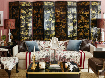
Dara Caponigro, the creative director of the iconic design house Schumacher, is something of a legend in the design world, and for good reason. She’s spent most of her career as a magazine editor, lending her exacting eye and beautifully honed aesthetic to pretty much every major shelter publication. It was during her tenure as Style Director for domino (which she helped launch) that design enthusiasts first got to know this genuine tastemaker, and her time as editor-in-chief of Veranda made that magazine a must-read. Today, this self-professed project lover is shepherding Schumacher into the digital age. She’s infused every aspect of the brand with her natural gift for storytelling, reinvented the showroom experience, and reimagined how new fabrics are introduced. To go along with her Chairish collection of picks, which includes a selection of gorgeous Schumacher pillows, Dara shared her thoughts on inspiration, design, and the secret behind Schumacher’s lasting success.

What do you like about shopping on Chairish? Any categories that it’s become your go-to for?There are so many amazing things, and most of them are so well-priced (please don’t ever change!). It’s like an edited eBay—so much easier to wade through. On my search for my favorite products (which wasn’t hard), I found a pair of white plaster shell lamps for my bedroom that are theatrical without being kitsch. And, of course, I love our pillows!
How would you describe your personal design style?
Very edited. Classic but clean (never sterile) with a bit of an edge. I always like something modern in a room—and if it gets too full, it makes me claustrophobic.
Where do you turn when you’re in need of inspiration for a personal design project?
My old House & Gardens and World of Interiors from the ‘80s and ‘90s. They haven’t been digitized yet, so the images still feel fresh and there is still a sense of discovery when looking through them.
What book should every design lover have in their reference library?
The New York Times Book of Interior Design and Decoration by Norma Skurka. Also, House & Garden’s Best in Decoration.

What’s a favorite decorating trick that you picked up from your time as an editor?
When you’re finished accessorizing, always take one thing away. It usually gets better through the editing process (but I am an editor after all!).
For you, what are the common factors that all truly remarkable interiors share?
They allow the personality of the person who lives there to shine through. They have a sense of scale. They are intelligent, meaning there is an understanding of what’s in them or what inspired them and that they’re not filled with pieces that just look good on a superficial level.
What advice would you give young designers starting out today?
Put time, energy and money into finishing your own place, and then get it out there via social or traditional media. You have artistic control over your own place, whereas you probably don’t over your first clients’ homes. Your own home is a great reflection of what you can do even if you don’t have the kind of money your client does. I have given that advice to many young designers, and I’ve watched them rise to the top of their field.

What’s a typical day at the office like for you?
I run from meeting to meeting, looking at product that’s just come in; planning our launches for down the road; discussing our showroom renovations; working with the marketing team on our much-loved digital newsletters, imaginative printed collateral and popular Instagram feed; planning shoots for our Bulletin; strategizing PR and events; meeting with the executive team to plan for what’s next from a business perspective. It’s endless but it’s so much fun.
What’s been the most surprising thing about transitioning from editor to creative director?
The most surprising thing is that it’s been such an easy transition. I use so many of the same skills at Schumacher that I did as an editor. Creating a collection is very much like creating a magazine. I need to be intuitive about what’s coming next in the same way I did as an editor, and I need a deep understanding of the interior design world so that our products are not only beautiful but usable. I oversee marketing, and that’s as editorial as it gets. We have fabulous and engaging stories to tell in words and in images. And, there’s nothing more fun than producing photo shoots and content with a point of view that’s fresh and relevant.

Schumacher has been around since 1889, and is still thriving today. Why do you think the company has stood the test of time?
Since it was founded, Schumacher has always been on the pulse. We were the first company to bring European decorative fashion to the U.S., the first to introduce Art Deco here and the first to partner with design collaborators beginning with Paul Poiret in 1930 (we just reintroduced his collection by the way). It’s part of our DNA to be on the forefront of decoration and our passion for it has been unceasing. We really believe that design matters. That belief comes from a place of authenticity, and that’s why I think we’ve stood the test of time.
We all love The Bulletin by Schumacher! Why did you decide to add a printed piece to the mix?
It happened organically. When we introduced the Miles Redd collection in 2015, we wanted to present it in a fun and inspiring way, so we created a whole newspaper to highlight it. That was such a hit that we had to do it again. Eventually, the newspaper morphed into a full-fledged magazine with paid ads! It seems to have struck a chord. To me, it’s a mix of what we did at Veranda and what we did at domino. Sophisticated without being snobby. Beautiful and transporting while still being helpful and interesting. Did you know you can now subscribe?

What’s something new, or currently in the works, at Schumacher that you’re especially excited about?
There are so many things. We actually launch new collections every single month. We have a very fun and out there collection of fabrics, wallcoverings and rugs that debuted in June by Charlap Hyman & Herrero that’s refreshingly cool. And then we have a New Traditional collection launching this fall that’s as pretty as can be. That’s what I love about Schumacher: we have an incredibly diverse portfolio where style is the common thread.
Pattern mixing can be tricky. What are some pattern combinations from the Schumacher collection on Chairish that you’d love to see used together in a room?
For a fun scheme: Nanjing, Fuzz and Deconstructed Stripe.
For a more feminine scheme: Toledo, Shengyou Toile and Mona.
Shop the Look
Product_id 1416212 not found
Shop Dara’s Chairish Picks >>
Portrait by Max Kim-Bee


