If picking a paint color for your kids’ bedroom is one of those parenting tasks that’s quickly devolved from sounds-easy to rather-do-anything-else, take solace; you’re not alone. These days, most agree that gendered shades of blue and pink feel passé, but what alternative colors are stepping up to the plate? And perhaps even more importantly: for those parents who’d prefer not to pick up a paintbrush for, oh, another fifteen years or so, what paint colors for boys’ and girls’ bedrooms have legitimate staying power?
If you’re knee-deep in paint swatches without a winner in sight, don’t fret. We’ve reached out to some of the industry’s most trusted designers and asked them to share their go-to hues. From an always-right shade of white to a gray that’s the equivalent of a teenage digital detox, here are eight Sherwin Williams, Farrow & Ball, and Benjamin Moore kids’ room paint colors that designers can’t get enough of!
Shop the Look
Product_id 2935056 not found

Primary Cool
When you figure that most parents want a kid’s room paint color that will transcend the years, why not go with the ultimate mutable shade? (i.e. white.) Given that the rest of her clients’ home was already painted in the bleached hue, designer Abby Wolf-Weiss decided to roll with Benjamin Moore’s Super White in the family’s boy’s bedroom. To avoid any chance of the color reading as mundane, Abby employed a palette of bold primary hues, which she knew would only be intensified by the walls. “We knew we wanted to use reds and blues with a pop of yellow, but in a way that didn’t look completely child-ish so that a young boy could keep growing with it,” she explains. Her secret for upping the refinement? A vintage Danish Modern light fixture that oozes collector-grade sophistication.

Feelin’ the Blues
If you’re not mad about blue for a boy’s room, but your outspoken offspring won’t have it any other way, consider choosing a paint color like Benjamin Moore’s Stonington Gray for the walls. Designer Allison Garcy selected the shadowy hue because of how its blue-purple undertones enhanced the rest of the room’s primary blue accents. “For this bedroom, it was important to choose a color that allowed some ‘room to grow,’” Allison explains. “The paint color needed to be subtle and elegant, but also on the lighter side. I like how this particular color has very cool undertones, but still emits a happy feeling.”

State of Gray
Just in case you needed proof illustrating how effectively gray walls can metamorphose into a teenager’s space, consider this soothing sanctuary teed up by designer Jodi Morton of 2to5 Design. Designing for a client’s teenage daughter, Jodi elected to cloak the room in Benjamin Moore’s Coventry Gray. A relatively true gray, the color allows the collected trappings of a teenager to intermingle without conflict. “The tone is so calming and relaxing,” Jodi explains, “perfect for calming down a busy teenager.”

Bali Baby
A Josef Frank textile and a client’s propensity for Floridian sunshine provided designer Michael K Chen with the color inspiration for this sweet nursery, which he opted to blanket in Benjamin Moore’s Bali. “The apartment as a whole has a few, very subtle tropical references,” explains Michael. “We wanted this room to be both calm and also playful, centered around a tropical-Scandinavian mashup, with blond woods, a vintage Finn Juhl rocker, color-blocked rug, and then the very soothing pale turquoise for the walls.” The tone toes the line between vibrant and soft, which makes it the kind of ubiquitous, gender-neutral shade that would energize any playroom or kid’s room.
Shop the Look
Product_id 2935056 not found

Neutral Territory
When it comes to kids, the only constant you can count on is change—hence the case for white walls that function like a canvas. For a boys’ bedroom designed by Denise MaGaha Interiors, the firm enlisted Sherwin Williams’s Pure White. The selection, which the team places on the “warm but bright” end of the achromatic spectrum, allowed them to layer on a neutral palette of grays, browns, and blacks without inciting discord. That said, the hue could just as easily support a more vibrant assemblage of colors, as illustrated by how well it teams with the room’s paprika-colored accents.

A Pop of Red Overhead
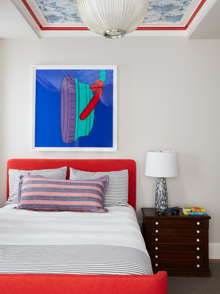
If you’re looking for creative ideas for painting a kid’s room, consider this spunky yet wholly sophisticated bedroom teed up by Alexandra Pappas and Tatyana Miron of Pappas Miron. The designer duo employed no less than three colors—Benjamin Moore’s Balboa Mist, Simply White, and Geranium, to be exact—as well a wallpapered ceiling panel by Stark to make the room feel one-of-a-kind. “We like to create kids’ rooms that veer more timeless,” explains Alexandra. “By selecting a more neutral palette with pops of color and pattern, decor can transition from toddler to teenager.” Red, in particular—a key color utilized in Pop Art—is a transient color that can read both youthful and refined, much like Pop Art itself.

Nocturnal Instinct
Moody hues aren’t generally frontrunners for kids’ rooms, but as designer Maren Baker proves, they can cue up a stunning effect. Benjamin Moore’s Nocturnal Gray provides a dramatic backdrop for a girl’s bedroom Maren designed for longtime clients who needed to move their daughter into their guestroom after the birth of their second baby. “The color was actually chosen to coordinate with their guest bedroom furniture,” Maren explains. Since it hadn’t been that long since they painted, and they weren’t ready to repaint, Maren paired a mulberry hue with the bottomless color to make it feel more tot-appropriate. The rich pink underscores the walls’ blue tone, making it feel akin to a dusky sky—ideal for instigating imaginative play.

Pink Enchanter
Nixing the notion that pink needs to entail princess regalia, Christopher Kent of studio CAK employed Farrow & Ball’s Middleton Pink in a tween girls’ bedroom. Christopher loves the color because of its propensity for reflecting light. “The hint of pink on the walls becomes bathed in the coziest glow at certain times of day,” says Christopher. “It simulates a loving hug.” To liberate the hue from its gender-specific connotations, Christopher opted to pair it with upholstered beds in a warm cognac hue. The dichotomy of a traditionally feminine color partnered with a masculine one makes the entire room feel a bit edgy, perfect for satiating soon-to-be discriminating teens.
Lead image design by Michael K Chen Architecture / Photo by Brooke Holm


