Decorators have long heralded the pacifying powers of paint, so to round up a palette of modern bedroom paint picks, we knew it was best to head straight to the pros. Since modern bedrooms usually entail minimal accents, that means the walls—and whatever color they’re cloaked in—will take center stage. While a daringly different hue might fly in a layered bedroom with era-bending style, the majority of modern bedrooms require something a bit more refined; subdued yet soulful. So what did the pros pick? Below are twelve striking hues, ranging from a soft, eucalyptus-y green to a vaporous gray inspired by fogged-in mornings to get you totally inspired.
A Brush With Blush

For a modern master bedroom she designed for a residence in San Francisco’s Nob Hill neighborhood, Chloe Warner of Redmond-Aldrich Design selected Farrow & Ball’s Calamine, a soft, ballet-like pink. “I love combining different shades of reds and pinks,” explains Chloe, “And this hue turned out to be a perfect, not-too-sweet blush that set off our cabinets and bedding.”
Aqua Fan

Channeling her couple clients’ favorite vacation destination, St. Bart’s, provided designer Amy Lau of Amy Lau Design with the color inspiration for the walls and ceiling of this breezy bedroom. Using Donald Kaufman’s DKC 57, Amy cued up a space awash in Caribbean cool. “I wanted to create a luminous atmosphere with the illusion of rippling monochromatic waters,” says Amy. “The ripple motif is echoed not only in the headboard, but the bench, rug, and the custom dyed ombre curtains.”
A Blustery Blue

For a bedroom in which he wanted to spotlight modernist lighting and striking pattern, Douglas Wright of Douglas C. Wright Architects dressed the walls in a hint-of-blue hue by Farrow & Ball. A subtle shade that evokes a bleached-out sky, the hue enhances the room’s saturated colors and offsets its dramatic graphic textiles without a hitch. Its propensity for mimicking the sky also means the color possesses the unique ability to lend the modernist lighting aeronautic appeal. Backed by the cheerful shade, a three-light dome pendant and mobile-like floor lamp feel almost airborne.
Shop the Look
Product_id 2624726 not found
A Touch of Frost

Modernists dating as far back as Picasso have always swooned over blue, so it’s no surprise that designer Thad Hayes of Thad Hayes Interiors selected a hushed shade of it for a sophisticated city sanctuary. The icy blue shade is a successful base for the mostly monochromatic—and highly minimalist—bedroom, as its silvery undertone reflects light, enhancing the room’s simple yet highly sculptural pieces.
A Serene Green

Given that blues and grays are shoo-ins for modern bedrooms, Laura U Design Collective wanted something a bit out of the ordinary. Sherwin Williams’s Bonsai Tint fit the bill to a tee for adventurous homeowners with an expansive art collection that included two softly hued abstracts in a pastel palette. “We wanted to create serenity and softness, but in an unexpected way,” says the firm. “This subdued green was a perfect alternative to the oft-used grays and blues.”
Shop the Look
Product_id 2570709 not found
Product_id 2352383 not found
Drops of Juniper

Bucking the notion that only nuanced neutrals will fly in a modern bedroom, designer Will Wick elected to use a dense evergreen hue for a superbly chic San Francisco bedroom. To pull off such a scene-stealing shade amid minimalist digs, Will drafted furniture with a bit more gravitas, opting for a radial chandelier and brass-clad Klismos bench with a Mid-Century Modern aesthetic. Generally speaking, sculptural accents will hold their own against deep color better than more traditional, straight lines.
Shop the Look
Product_id 2285794 not found
Sieged by Griege

“I don’t love color on walls, usually,” admits Jennifer Fisher of J. Fisher Interiors, who selected Benjamin Moore’s Grége Avenue for this master retreat. “When I select a shade for a client, I like to stick with neutrals. Although ‘greige’ colors aren’t a new phenomenon, they appeal to me because they compliment almost any decor style without detracting from the design, colors, or theme of a room.”
Shop the Look
Product_id 1909797 not found
A Tactful Khaki

Neal Beckstedt of Neal Beckstedt Studio makes a compelling case for an oft-overlooked shade in this modern bedroom city perch: khaki. “The space initially was very sparse and cold, with plain white walls that felt devoid of character,” says Neal. “I felt that a khaki color—one that mixed shades of beige—would radiate warmth and make the apartment feel more substantial. The paint complimented the wood elements in the room, creating a cohesive and unified palette.”
A Bay-Inspired Gray
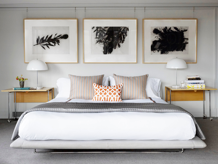
In a modern bedroom, going gray pays off for a lot of reasons, which is why JKA Design elected to use Benjamin Moore’s Stonington Gray in a San Francisco master. “We chose this color for a few reasons,” explains designer John Anderson. “First, it’s just a lovely soft enveloping gray for a bedroom. Secondly, it makes a great backdrop for art, especially for our client’s ever-changing collection. Lastly, the room faces north toward the San Francisco Bay. The color responds so well to bright mid-day sunlight light as well as foggy mornings and late afternoons.”
Shop the Look
Product_id 2813590 not found
A Great White

Few palettes feel as calm and collected as all-white, which is part of the reason why designers deploy it frequently in modern bedrooms. For a sophisticated Brooklyn bedroom, the firm CWB Interiors selected Benjamin Moore’s Intense White. The hue essentially acts as a bias-free background, allowing modernist furnishings that might be overpowered by other colors to shine.
A White That Delights

While a white with a too-yellow undertone can look aged, a white with too blue of a tint can look lack feeling. Opting for a firmly middle-of-the-spectrum shade, Jamie Bush of Jamie Bush + Co. elected to use Benjamin Moore’s Simply White for a modernist bedroom spiked with bohemian allure. “We love Simply White for a warm modernist home,” says Jamie. “It’s fresh but never stark and works well with softer wood tones.”
Shop the Look
Product_id 2630022 not found
Product_id 2706322 not found
Bonus: Go with the Gradient

Sometimes committing to a single wall color just isn’t enough, as was the case for Michael Chen of Michael K. Chen Architecture when he was tasked with outfitting this bedroom on the fifth floor of a Manhattan townhouse. “We loved how the light felt in the space, and worked with Calico Wallpaper on a custom colorway of their Aurora wallcovering to capture a feeling of the sunrise,” explains Michael. “The room is just meant to be cheery, but serene, shifting from a sky blue to a deep orange and the baseboards are painted to match in Benjamin Moore’s Succulent Peach—I mean, c’mon.”
Lead image by Marili Forastieri / Design by Neal Beckstedt


